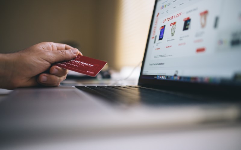
The biggest impact on sales your e-commerce site can have is directly correlated to its design and layout. Your site has to be efficient, and your customers need to find the products they are looking for right away. The chances are pretty low any customer will spend more than 5 minutes digging for what they need when they can just go to a rival site in a matter of seconds.
So, when your whole business structure is online, your website is your salesperson. The webpage your customers come to is your brand’s representative. This is why it’s important that it is efficient and enticing. In this article, we will pay special attention to some of the main areas in which you should focus if you want to build a successful and well-designed e-commerce website.
Highlight your brand and the uniqueness of your offers
Your homepage is a great place to show off who you are and what you are about. It is a great starting place to show all the best selling items and any promotions you might have. The best way to do this is to show your products from all the angles you can. Highlight their best or unique features. Visual product information will give your customer an introduction to the product itself and its value. So invest in high quality, eye-catching authentic photos and explainer videos. It’s important that the customer can imagine the product in their possession and not just a static picture. That’s what separates an e-commerce portal that converts well from a bad website.
Use high quality gifs and video
High-quality product images have a big impact on your customers’ decisions, but product videos are even more effective in driving up sales rates. Our brains process visual information about 60 000 times faster than we do text. Videos will encourage your customers to remain on your website for a longer period of time and to eventually return. A 360° high-quality gif will make images less boring and will involve customer interaction. Gifs, however, are not a great way to get your customer to see your product better and in more detail.
Product categories and search function
The worst thing you could do is to confuse your customers when they browse your site. That’s why navigation should be quick and easy. Add a search engine that neatly compiles your product catalogue. Not only does it allow users to compare products, but will greatly speed up any search they have on your website. If your e-commerce website has many similar products in the same range this feature will be priceless. Comparisons should be easy to use, or the customer might click away, best to have the option near the image of the product.
Simple and fast checkout options
One crucial element of any e-commerce site is its checkout process. When implemented in the wrong way it can cancel out everything we did well earlier. There are a couple of key things we should consider when trying to make the best checkout experience. Speed, easy form filling, progress indicators as well as a persistent cart summary. Anything you can offer that reduces the objection to buying, like free shipping and coupon codes, will see your conversion go up even more.
Conclusion
While implementing various elements try to A/B or multivariate your e-commerce design elements and see what best works for your product. This is a cost-efficient way of finding out what made your customers complete their purchase. Every e-commerce website will benefit from constant optimization. Your website should constantly be evolving, with every design element chosen for a reason, tested and refined. The ultimate goal here is driving up conversions.
The ultimate three questions about any e-commerce design are this: How does my customer feel about my brand or product? Does it provide all the information it can so that the customer can complete the purchasing decision? Is the completion of the purchase easy? When your site’s own metrics are the guide you can’t go wrong.
Also read: 8 Surefire Ways You Can Streamline Your Ecommerce Business
