Designer Ghani Pradita from Yogyakarta, Indonesia has envisioned and designed a concept UI for Windows Phone 9. His design derives elements from the Windows 8 desktop version.
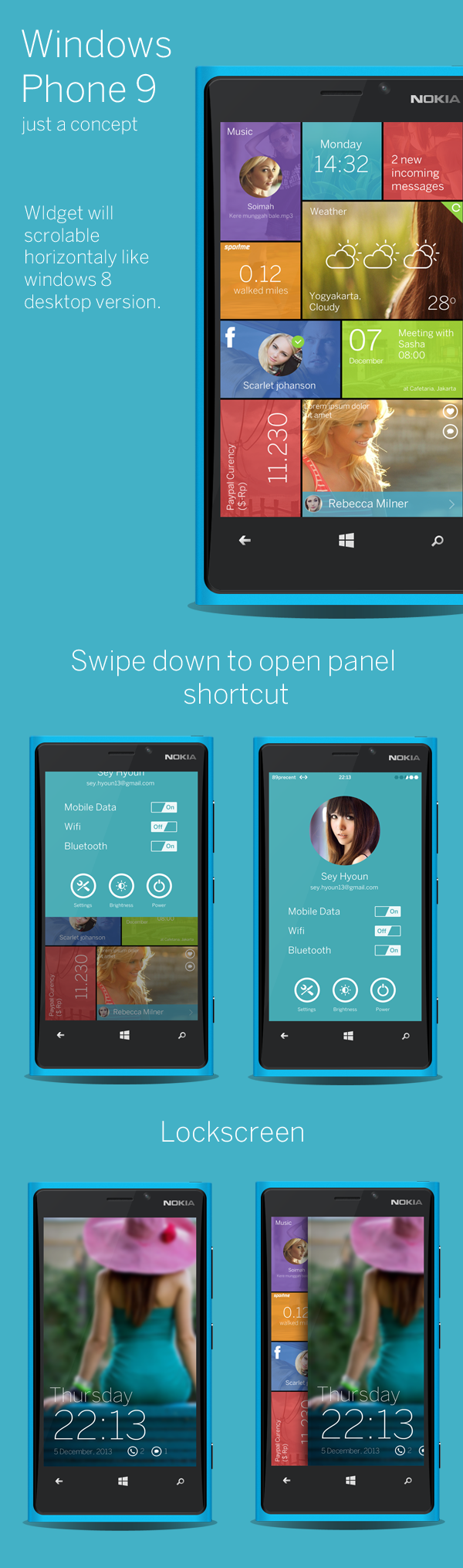
Unlike Windows phone 8 where you can select only one theme color for the start screen tiles, the concept shows option of different colors for different tiles along with a background image, something which apps like Skinery Themes currently try to offer by partnering with app developers. However, due to platform limitations Skinery Themes doesn’t support stock apps such as Phone and Messaging on Windows Phone 8.
The concept also shows swipe down to get quick shortcuts to turn on/off settings like Mobile Data, Wifi and Bluetooth. This again is something that many apps like Settings Express are trying to solve on Windows Phone 8.
Have a look at Ghani’s Windows Phone 9 UI Concept above and let us know your thoughts. In my opinion, having a platform support for customizing tiles with background images and colors is a nice touch. Having accessibility to settings options on a swipe down would also be a welcome change for me as a user.
My only advice is for MSFT to move away from the stark black screens with white text. Yes, it is minimal, but comercial users need a bit more visual interest IMO. Not sure why I’d want to look at something that stark in comparison to other platforms. If they can bring in some of the slight shadow and gradient as seen in the XBox 360 version of Metro then that would be really awesome. Gotta have more visual interest going forward.
What’s sad is that when it comes to Windows Phone, a lot of people have started to state that Metro design strictly means lack of gradients and visual assets like background images. But as you rightly point out about the XBox 360 version of Metro which adds more visual interest by making use of slight shadow and gradient.
Btw, Congrats on your launch of Word Search Little Books on Windows Phone. Your Cross Platform Mobile reach of the app is quite impressive.
I’m not sure if I understand you correctly so sorry if I am wrong. I personally think the plain black with the simple white writing is awesome! I am one for simplicity and no distractions. I’m not sure if it makes much of a difference either, but I think it does help with battery life somewhat. Battery alone is worth keeping the look I personally believe. But then again, I could have just misunderstood you.
This doesn’t feel like Metro to me. This feels more like the next evolution to Android’s UI. The only thing I like in this concept is the appearance of the tiles, and though they don’t follow Metro’s UI guidelines, it looks really nice. But yeah, overall, it feels like Android.
this is something I hope MS is moving towards with WP. WindowsPhone UI hasnt changed and I think its time it does. Not radically but this concept I think keeps with the Modern UI and how it should look as it evolves. Like most concepts unfortunately they never get implemented. The only aspect of Android I see is the Heart icon in the tile, similar to Google Now Cards. I just got rid of my HTC One and Nexus 5 and see no similarity to Android.
I think present swipe up on the lock screen is better than swiping right or left. Users are practising this swipe left or right (ex- on some slider or bubble on Droid phone) to unlock the phone, change is good.