Responsive web design tools help you check whether a site remains usable as its viewport, input method, and browser change. Browser emulators make quick checks easy, while automated tests catch regressions. Neither can fully replace trying important pages on an actual phone or tablet.
This guide focuses on a practical workflow for developers, freelancers, and small teams: start with tools already in your browser, automate repeatable checks where they save time, and use real devices for the interactions that emulation cannot reproduce.
Responsive web design tools worth using
Chrome DevTools Device Mode
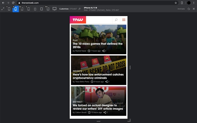
Chrome DevTools Device Mode lets you resize a page to a chosen viewport or drag it through different widths. You can also simulate touch input, change device-pixel ratio, rotate the viewport, capture screenshots, and approximate slower CPU or network conditions. It is a convenient first stop when a layout breaks or a breakpoint behaves unexpectedly.
Device Mode is an approximation, not a physical phone. Chrome's documentation notes that it does not run your code on mobile hardware; device architecture and some mobile behavior differ. Treat its screenshots and throttling as debugging aids, not proof that a page works on every device.
Firefox Responsive Design Mode
Firefox Responsive Design Mode offers an adjustable viewport, device presets, touch simulation, pixel-ratio settings, screenshots, and approximate network throttling. It is useful for checking the same layout in another browser engine and for investigating browser-specific CSS behavior.
Like other emulators, it cannot reproduce every physical device condition. Use it to find issues quickly, then confirm important fixes in the browsers and hardware your audience uses.
Playwright for repeatable viewport checks
If your project already has browser tests, Playwright's device emulation can run the same navigation or interaction checks with different viewport sizes and device settings. For example, a small test suite can cover a narrow phone-sized viewport, a wider mobile viewport, and a desktop layout after changes to shared components.
Automated emulation is most useful for catching regressions in known flows, such as opening a menu, submitting a form, or reaching a page footer. It does not confirm how the page feels on a real touchscreen, and screenshots can show visual changes without telling you whether those changes are usable. Add it when repeatable checks justify the setup and maintenance; a small site may be better served by a manual browser checklist.
A real phone or tablet
Use at least one actual mobile device for high-value pages and interactions. Check touch targets, menus, form controls, text selection, scrolling, orientation changes, and the browser's on-screen keyboard. A page that looks correct in a desktop emulator can still feel awkward on a phone.
For Android phones running Chrome, Chrome's remote debugging guide explains how to inspect a connected device from desktop DevTools. For other platforms, test directly in the browser your customers use. You do not need a large device lab to catch common problems: borrow or share a representative phone and keep a short list of pages and tasks to repeat.
Check a visitor's screen details with MDigi Tools
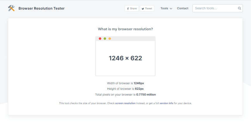
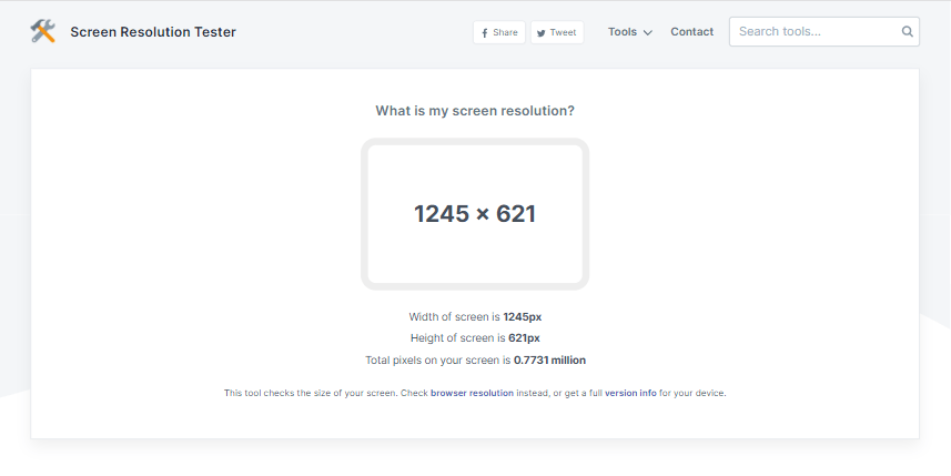
If a client reports a display problem and you need the dimensions their browser reports, the Browser Resolution Tester and Screen Resolution Tester can help gather context. The browser and system version checker can provide additional details when diagnosing a support issue.
These tools report information about a visitor's current setup; they do not test your site at other widths or prove that it is responsive. Ask for the page URL, browser, device, and a description or screenshot of the issue, then reproduce it in a browser or on a device.
Standards and implementation references
- MDN's guide to media queries explains how to adapt styles to viewport width, input capabilities, and user preferences.
- web.dev's responsive design course provides a broader learning path for layouts that adapt to different screens.
- MDN's responsive images guide covers
srcset,sizes, and<picture>for choosing suitable image sources. - WCAG 2.2 Reflow guidance describes how most content should work at a width equivalent to 320 CSS pixels without requiring scrolling in two directions. Some content, such as a data table, may need a two-dimensional layout.
A practical responsive-design workflow
1. Start with the content and viewport
Add a viewport declaration so mobile browsers lay out the page at the device's CSS width:
<meta name="viewport" content="width=device-width, initial-scale=1">
Do not disable user zoom. First make the content and controls work in a single flexible column; add columns or navigation changes only when the content needs them.
2. Use flexible dimensions and content-driven breakpoints
Avoid designing around a fixed list of device models. Let content determine when a layout needs to change. Grid, Flexbox, relative units, and bounded fluid sizes can cover many widths without adding a media query for every screen.
.page-layout {
  display: grid;
  grid-template-columns: minmax(0, 2fr) minmax(15rem, 1fr);
  gap: clamp(1rem, 3vw, 2rem);
}

img,
video {
  max-width: 100%;
  height: auto;
}

@media (max-width: 48rem) {
  .page-layout {
    grid-template-columns: 1fr;
  }
}
The 48rem breakpoint is an example, not a universal device boundary. Adjust it when your own content starts to feel cramped. For images, include intrinsic width and height attributes where possible to reserve space while files load. Use responsive image sources when a smaller file or a different crop is appropriate.
3. Test the layout, not just a device preset
In Chrome or Firefox, resize continuously and inspect the points where your content or navigation stops fitting. Check the narrowest width you support, widths immediately around each breakpoint, and a wide desktop window. Look for horizontal overflow, clipped text, overlapping controls, awkward line lengths, and images that distort or push content off-screen.
Test longer labels and real page content, not only generic sample copy. Open menus, use forms, follow links, and scroll to the end. If the project has automated browser tests, use a few representative viewport configurations to guard its most important tasks.
4. Check accessibility and interaction
Try keyboard navigation, visible focus, browser zoom, and touch interaction. At a narrow viewport or high zoom, ordinary content should reflow without forcing horizontal scrolling; the WCAG Reflow explanation gives the 320 CSS-pixel reference and its exceptions. Make sure controls remain usable and are not available only on hover. If your design responds to motion or color-scheme preferences, check those states too.
5. Confirm on a real device
Before a major release or a change to a shared layout, repeat the key tasks on a real phone or tablet when possible. Pay particular attention to touch, the on-screen keyboard, device orientation, and differences between mobile browsers. Emulated network and CPU throttling can suggest where to investigate, but they do not reproduce every device's performance.
Related responsive design resources
For foundational context, see our guides to why responsive design matters, responsive CSS frameworks, responsive web design patterns, and web accessibility techniques for developers. If you are building on WordPress, see our WordPress themes collection.
Images from the previous edition
These screenshots are retained from the earlier version of this article for historical context. They depict tools mentioned in that edition and are not recommendations or evidence of current tool support.