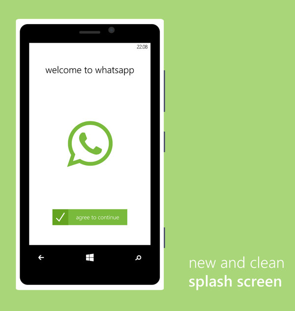
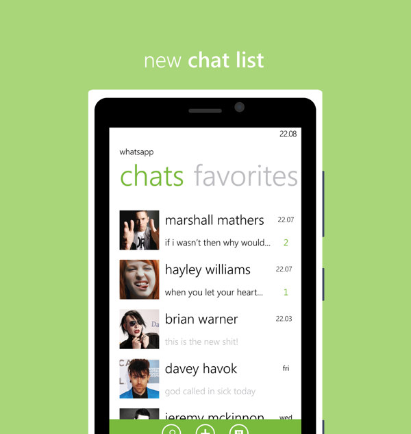
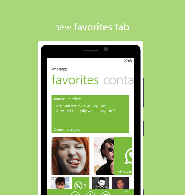
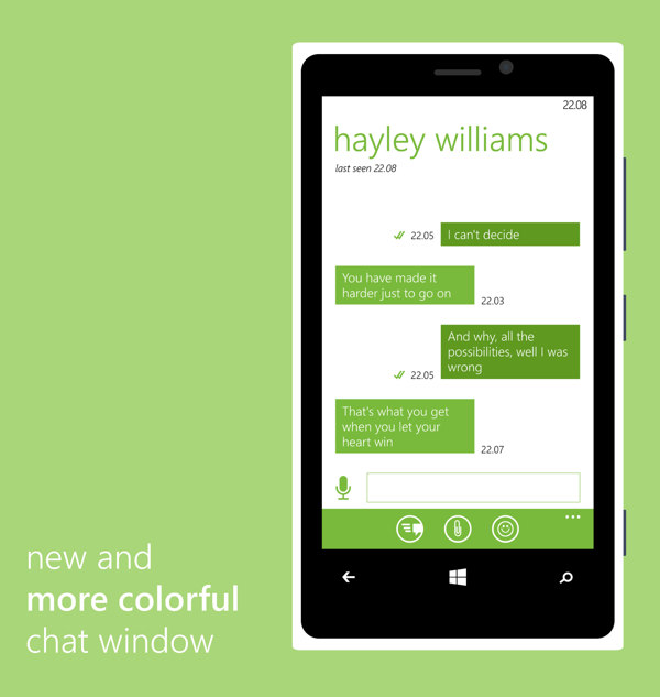
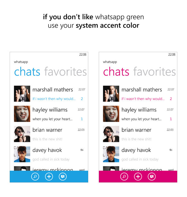
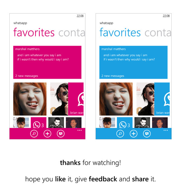
From time to time, we bring you design concepts for inspiration, and this time we have brought you redesign of one of the most popular messaging app, WhatsApp for Windows Phone.
This redesign is done by Juan Pablo Ursic, a Graphic Design Student from Argentina. While WhatsApp on Windows Phone is already designed in accordance with the design principles of Windows Phone, however lack of brand colors and use of the default system colors make it look similar to the stock message app.
Juan’s redesign of WhatsApp brings more focus to its brand color and demonstrates additional UI customizations.
Do visit Juan’s WhatsApp redesign on behance.net for giving feedback!
Before you go
DVLUP is giving free design make-over to 30 selected apps on Windows Phone. Sanjay Sharma, one of the winners selected, has shared his experience of this makeover-session and notable quotes in his blog.
If you missed the chance to get into this make-over sessions, you still can apply using your DVLUP points.


Fantastic post! And, thank you so much for the mention.
You are welcome and Thank you sharing your experience with everyone! :)
What a great work…love u guys…better than original..
I love the eminem reference
<3