
Tailwind CSS has moved on considerably since many starter kits and component collections first appeared. Start with the official documentation for your project's Tailwind version, then choose add-ons based on the framework and behavior you actually need.
This guide groups resources by task: setting up or upgrading Tailwind, improving editor feedback, adding common styles, choosing components, and building HTML email. Tailwind CSS 4 introduced a CSS-first configuration model and new setup paths, so check a library's installation instructions, peer dependencies, supported Tailwind version, and license before copying it into a project. If your site must support older browsers, review Tailwind's current browser compatibility requirements as well.
Set up or upgrade Tailwind CSS
The official Tailwind CSS documentation has installation instructions for common build tools, including Vite, PostCSS, and the Tailwind CLI. Its theme variables guide explains how to define design tokens in CSS, and the upgrade guide calls out changes when moving between major versions.
For an existing project, first check the installed tailwindcss version and build configuration. Follow the matching installation guide rather than mixing older JavaScript configuration examples with the v4 CSS-first workflow. The v4 release notes explain the architectural changes; the framework's MIT license is published in its repository.
Get better editor feedback
Tailwind CSS IntelliSense is the official Visual Studio Code extension. It adds Tailwind-aware completion, linting, and hover information to the editor. The editor setup documentation covers configuration and troubleshooting.
Add focused styling plugins
The Tailwind Labs forms plugin provides a form-control reset designed to remain easy to customize with utilities. The typography plugin supplies readable defaults for long-form content you do not fully control, such as rendered Markdown. Both repositories publish their license and installation instructions; check their version notes before adding either plugin to a v4 project.
Choose components that fit your project
- Unstyled building blocks: Headless UI provides accessible, unstyled components for React and Vue. It is a good fit when you want interaction behavior but need to own the visual design. An accessible component is not a substitute for testing your finished page with keyboard and assistive technology.
- Pre-styled utility components: daisyUI adds semantic component classes and themes on top of Tailwind. Its installation guide is the place to check setup for your Tailwind version; the project publishes its MIT license.
- A broad component set: Flowbite offers Tailwind-based components and JavaScript interactions. Its license page distinguishes the open-source core from separately licensed Pro material, so check the terms for the exact components and assets you plan to ship.
- Code you can own and adapt: shadcn/ui provides framework-specific installation and component code that you add to your project, rather than a traditional one-size-fits-all component package. Review the generated code and dependencies as part of your own maintenance and licensing process.
Before choosing a kit, check whether it supports your framework and Tailwind major version, whether components require extra JavaScript, and what you will need to update yourself. Compare the actual package and asset licenses—not just the library's headline license—before using a kit in client work or a commercial product.
Build HTML email with Tailwind
Maizzle is a framework for building HTML email with Tailwind CSS and email-focused processing. Its current documentation describes the setup and workflow. The Maizzle site also links to Mailviews' email template gallery, which is useful for browsing examples. Email clients support a different subset of CSS from browsers, so test the final message in the clients your audience uses.
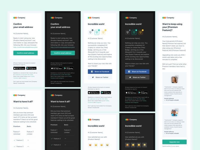
Earlier template previews
The following images are the previews preserved from the original article, published in 2020. They are included for continuity, not as current screenshots or a claim that each project supports Tailwind CSS 4. Check the linked product page, repository, release history, framework requirements, and license before using an older starter. A page loading successfully does not by itself establish that its code is maintained or compatible with your stack.
Creative Tim Notus kits
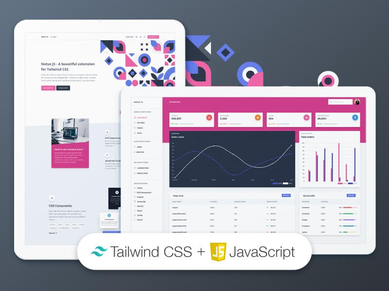
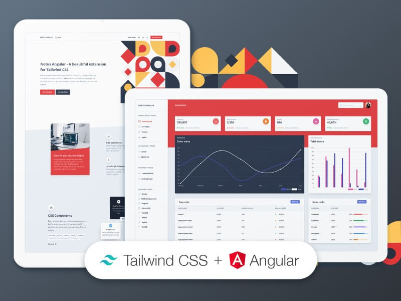
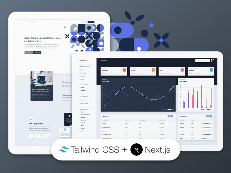
The original roundup featured Notus kits for several frameworks. The product pages still resolve; use the one for your stack and check its current download and version information before adopting it.
Notus JS
Product: Notus JS · Live preview
Notus Angular
Product: Notus Angular · Live preview
Notus Next.js
Product: Notus Next.js · Live preview
Notus Svelte
Product: Notus Svelte · Live preview
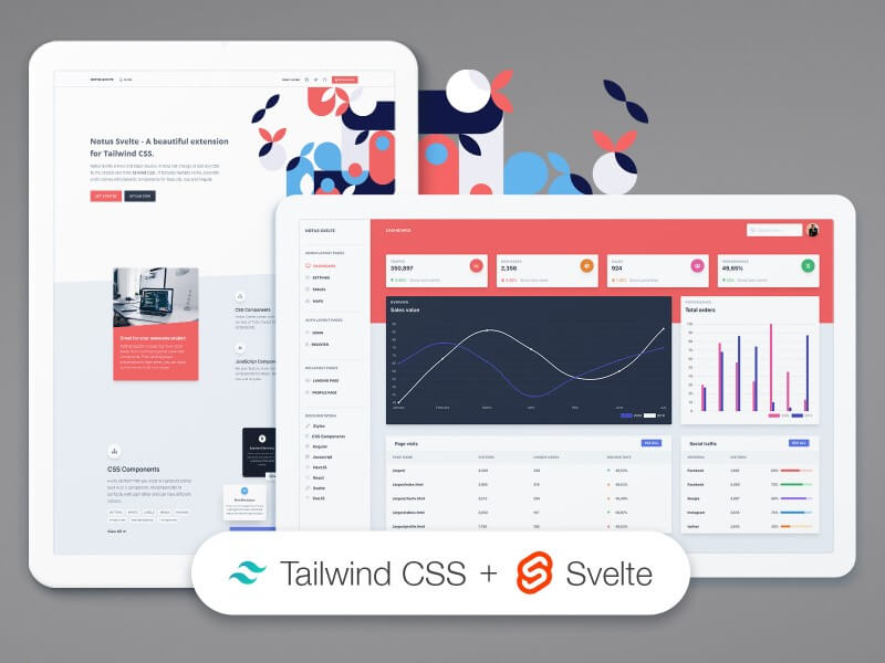
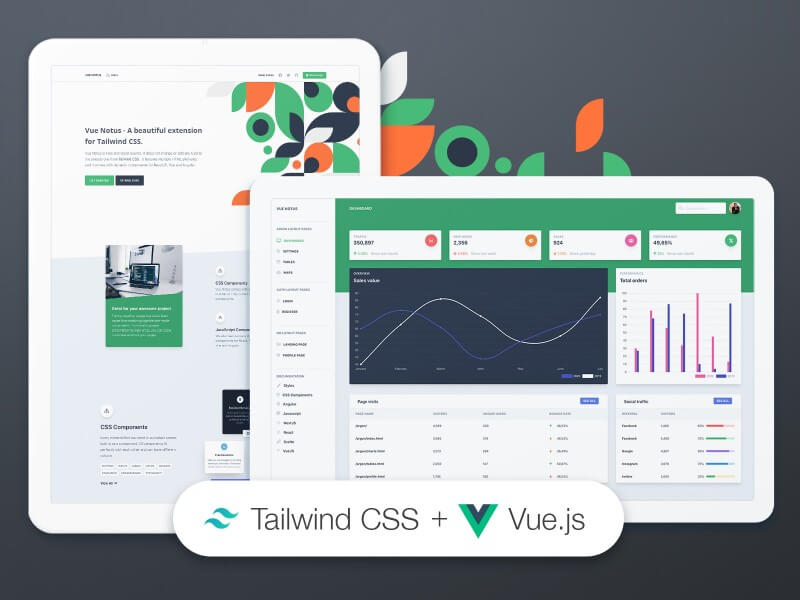
Vue Notus
Product: Vue Notus · Live preview
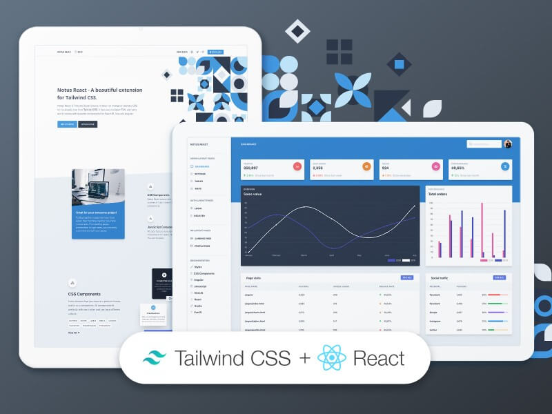
Notus React
Product: Notus React · Live preview
Other original projects
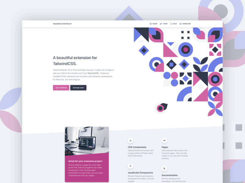
Tailwind Starter Kit / David UI: the old Tailwind Starter Kit presentation and download URLs now lead to Creative Tim's David UI page. Use that current page for product details; the image below is the original Starter Kit preview, not a screenshot of David UI.
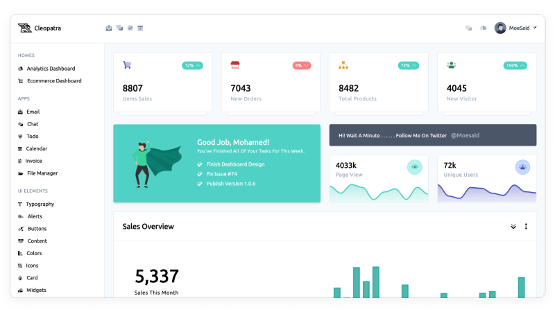
Cleopatra: an admin dashboard template. Its GitHub repository declares an MIT license; the live preview is also available. Confirm its framework and Tailwind compatibility before reusing it.
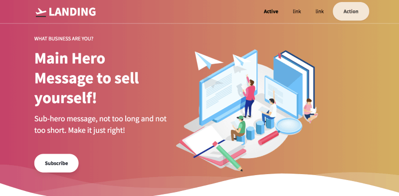
Tailwind Toolbox Landing Page: the old download page redirects to the project's GitHub repository, which declares an MIT license. Check its README and source before using the template.
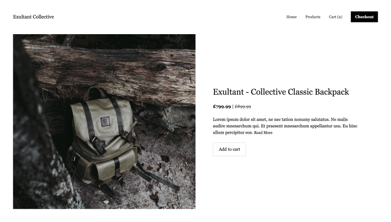
Digizu Product Showcase: the original template preview and source repository remain available. Review the repository's code and license before adapting this older layout.
A practical way to choose
- Match the resource to a real need: official setup docs for installation, IntelliSense for authoring, a plugin for a focused style, or a component kit when you need prebuilt interactions.
- Confirm Tailwind and framework compatibility in the current instructions and package metadata. Do not assume a resource that uses Tailwind also supports every major version.
- Read the licenses for the library, its dependencies, and any bundled icons, fonts, or images. Free to download does not automatically mean every asset can be used in a commercial project.
- Install only what the project needs, then test responsive behavior, keyboard interaction, form states, and the browsers your users rely on.
Tailwind CSS is flexible, but a starter kit saves time only when its code, version support, and license fit the project. Start with the official docs, add the smallest useful set of tools, and keep responsibility for updates and accessibility in your own workflow.

Thank you for making this curated list about Tailwind CSS. I really love this framework and currently, using for all my projects.
I think it could be interesting to add another resource in this article: https://github.com/ixartz/Next-JS-Landing-Page-Starter-Template
You can find a live demo at: https://creativedesignsguru.com/demo/nextjs-landing-page/