When I was redesigning a few sites, I wanted to put a fixed width sidebar to place ads. But since I was working on to make a responsive design for the site, a sidebar based on grid layouts which are based on percent-width wouldn’t have solved my purpose. In this post, I will share the CSS which I used to create a fixed width sidebar for this site, while keeping the entire site layout responsive and suitable for mobile views.
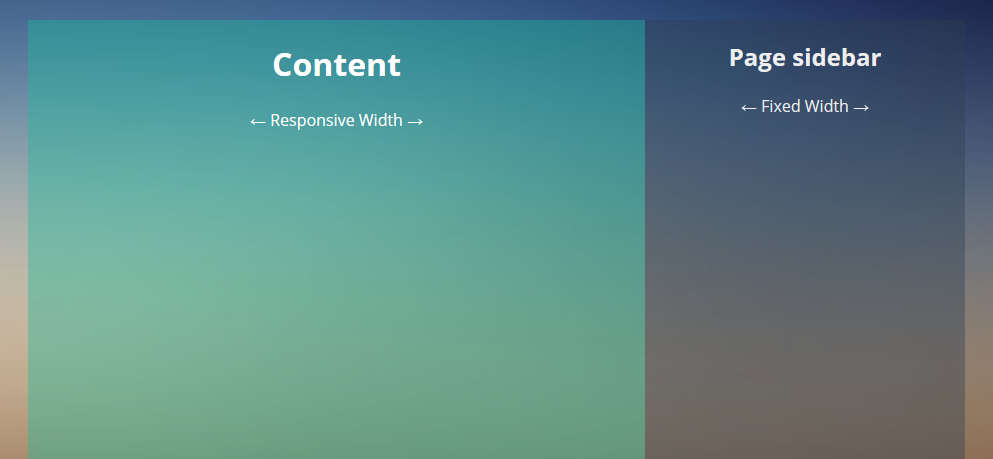
You can see the final demo by tapping on the preview image below. Try resizing your browser window to see the fixed width sidebar inside a responsive layout.
HTML for page layout
Find below the HTML needed to create the layout of the page. We are using a div of class wrapper to wrap our content as well as sidebar. This wrapper provides a maximum width to our page layout which I have chosen to be 1160px in the CSS. You can increase this width as per your own need. This wrapper also has left and right margin set as auto in CSS which helps it to stay at the center of the page.
<div class="page">
<div class="wrapper">
<div class="content-wrapper">
<div class="content">
<h1>Content</h1>
<p>← Responsive Width →</p>
</div>
</div>
<div class="sidebar">
<h2>Page sidebar</h2>
<p>← Fixed Width →</p>
</div>
</div>
</div>We would need an additional wrapper for our content called content-wrapper which we are going to make of width 100% and with a float property of left. This allows our sidebar to stay on top of the content wrapper instead of flowing down.
CSS for wrappers
This is how our final CSS looks for the page and content wrapper divs. You can ignore the min-height attribute as it has been added only to give a height to the demo without placing any content.
.page {
  margin: 20px 0
}

.wrapper {
  max-width: 1160px;
  margin: 0 auto;
  position: relative;
  padding: 0 20px;
  min-height: 600px;
}

.content-wrapper {
  float: left;
  width: 100%;
}
CSS for content and sidebar
Before writing the CSS for content and sidebar, we need to determine the size of our fixed width sidebar. I have chosen a width of 320px for our sidebar. If you choose any other size then do make sure to change the appropriate values in the CSS shown below.
.content {
  margin-right: 320px;
  clear: both;
  overflow: auto;
  background: #1abc9c;
  background: rgba(26,188,156, 0.4);
  min-height: 600px;
}

.sidebar {
  position: relative;
  width: 320px;
  margin-left: -320px;
  float: right;
  overflow: hidden;
  background: #2c3e50;
  background: rgba(44,62,80, 0.4);
  color: #eee;
  min-height: 600px;
}
Depending on the fixed width of our sidebar, we have applied a margin of same width to our content. Since I am placing my fixed width sidebar on the right, I have applied a right margin. We will then give a fixed width of 320px to our sidebar with a negative margin to make it appear next to our content inside our content-wrapper.
We are pretty much done for larger screens and will have the page content have a responsive width while the sidebar maintaining its fixed width for different screen sizes. However there is still some work left to optimize it for small screen devices such as smart-phones, as this fixed width sidebar can actually take up the entire width (320px) on the small screens leaving no space for the content.
Responsive layout on mobile
For the mobile screens, I am going to hide the sidebar altogether and just stick with the main page content. This is an ideal way to display content on small screen devices and generally you should not be placing any important content in the sidebar. Here is the CSS to hide the fixed width sidebar when viewed on mobile devices. Note that I am using a media query breakpoint of 768px, below which the sidebar will get hidden. If you want to hide the sidebar for tablets too, you may opt for a bigger size for this breakpoint.
@media only screen and (max-width: 768px) {
  .sidebar {
    display: none;
  }
  .content {
    margin-right: 0;
  }
}
Demo of fixed width sidebar
We are now done with creating our fixed width sidebar in a responsive web design layout. You can view the demo as well as the full code on CodePen using one of the options below:
Fixed width sidebar on left
In case you want the sidebar on the left, instead of right, then some minor tweaks in CSS margins would get us the desired result without the need of changing the HTML. Find below the code pen demo with fixed width sidebar on left.
Fixed width Sidebar on Left Demo & Code
We are using the same logic to create a fixed width sidebar on this blog. You can see the sidebar on this site too as an example of the fixed width sidebar in responsive layout. Hope you found this Tutorial useful! Let me know if anything doesn’t work for you.
http://jnet.sytes.net/apps/Round_Images/
for live test the frame is at the bottom instead of top right how do i move the iframe? (the iframe is the right hand menu im trying to implement any ideas?
Hi Jay, We are not using any iframe to implement the layout suggested above. Are you sure you are referring to the tutorial in correct way?
Hi Kanishk!
I can’t seem to be able to put the sidebar to the left, any tips?
Hello Victor, I have updated the post to include a demo for fixed width sidebar on left. You can find the demo on codepen here: http://codepen.io/kanishkkunal/pen/ZBmrGx
Thanks a lot!
When there is more content text in sidebar than in the ‘contents’ div and the sidebar height is increased, the footer doesn’t move down and the layout looks broken. How can we fix it?
The ideal layout would be where the heights of both columns stay the same.
Thanks Aqeel for reporting this issue. I forgot to include clearfix for page class. Kindly add the following CSS snippet to fix this. I have updated the CodePen demos too.
.page:after {

  content: "";

  display: table;

  clear: both;

}
The footer should now stay on it’s own row even if the sidebar content is longer.
Correction: There is no div with a class of “content”
It is , so the CSS should read:
.content-inner {
margin-right: 320px;
clear: both;
overflow: auto;
background: #1abc9c;
background: rgba(26,188,156, 0.4);
min-height: 600px;
}
… or did I miss anything?
There was an error in the code shown in the post. The class ‘content-inner’ should actually be ‘content’. Kindly see the CodePen demo which contains the correct code and a working demo.
I have corrected the class name in the post too. Thanks for pointing out the mistake Francis.
great code. Is there a way to collapse this with a Hamburger to be able to get full view of page and vice-a-versa. Example idea is, have a few data pages and content is crowded with sidebar out, would be nice if user can collapse sidebar to view whole page content, then when done viewing can re-open sidebar.
What you are looking for is called a slide-out off-canvas sidebar. Check out these great examples of sidebar transitions https://tympanus.net/Development/SidebarTransitions/ and corresponding article here: https://tympanus.net/codrops/2013/08/28/transitions-for-off-canvas-navigations/
Why sidebar is display: none ?
@media only screen and (max-width: 768px) {
.sidebar {
width: 100%; min-height: 100px;
}
.content {
clear: both; margin-right: 0;
}
}
Your query is already answer in article. Let me repeat it below:
“For the mobile screens, I am going to hide the sidebar altogether and just stick with the main page content. This is an ideal way to display content on small screen devices and generally you should not be placing any important content in the sidebar.”
Nonetheless, if you are showing the sidebar on mobile, you are more than welcome to do so as per your choice.
Just a side note:
We can now make such sidebar using flexbox instead of float as browser support for flexbox is now more prevalent.