In this article, we will try to create Glassmorphism UI in quick and simple way. You will find CSS and HTML for panels and buttons as well as live demo of the UI with frosted glass effects aka Glassmorphism.
What is Glassmorphism?
Glassmorphism is a design style where UI are created with transparency and background blur to get a frosted-glass like effect. With Glassmorphism we try to create virtual glass like effect that allows UI elements to have a see-through effect while giving an appearance of depth or layers.
Here are the characteristics you need to keep in mind when creating a Glassmorphism UI element:
- Transparency to make the see through happen.
- Blur to create an effect of frosted glass.
- A background image for the parent to see through the element.
- Border (with transparency) to create an edge for the glass element. (Optional)
Glassmorphism Panel CSS
For creating panel with Glassmorphism effect, we will be using the following code:
.glass-panel {
  color: #fff;
  margin: 40px auto;
  background-color: rgba(255,255,255,0.06);
  border: 1px solid rgba(255,255,255,0.1);
  width: 100%;
  border-radius: 15px;
  padding: 32px;
  backdrop-filter: blur(10px);
}
Here transparency is achieved by using a background-color with alpha of 0.06. Blur has been achieved using backdrop-filter and border has also been added with alpha (transparency).
Glassmorphism Button CSS
For creating buttons with Glassmorphism effect, we will be using the following code:
.glass-button {
   display: inline-block;
   padding: 24px 32px;
   border: 0;
   text-decoration: none;
   border-radius: 15px;
   background-color: rgba(255,255,255,0.1);
   border: 1px solid rgba(255,255,255,0.1);
   backdrop-filter: blur(30px);
   color: rgba(255,255,255,0.8);
   font-size: 14px;
   letter-spacing: 2px;
   cursor: pointer;
   text-transform: uppercase;
 }

 .glass-button:hover {
   background-color: rgba(255,255,255,0.2);
 }
Here transparency is achieved by using a background-color with alpha of 0.1. Blur has been achieved using backdrop-filter and border has also been added with alpha (transparency). Additionally, a hover effect has been added which decreases the transparency and makes the button look active/selected.
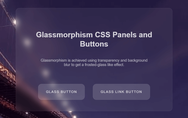
Glassmorphism UI Demo
Find below the demo of the CSS code working in action:
See the Pen Glassmorphism CSS Panels and Buttons by Kanishk Kunal (@kanishkkunal) on CodePen.
If you are using RSS feed reader, or by any chance the embed above doesn’t appear then please visit this Pen on CodePen
Browser Support
Notice that we used backdrop-filter in our CSS code. At the time of writing this article here is the browser support of property backdrop-filter as per caniuse.
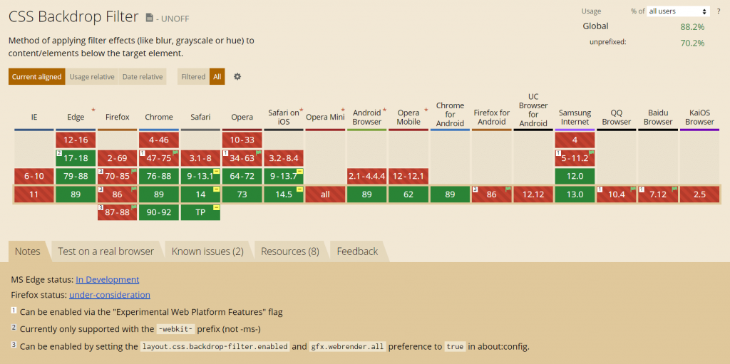
You will find that all major versions of Chrome, Safari, Edge and Opera support backdrop-filter property. However, on Firefox, you will need to enabled it by setting the layout.css.backdrop-filter.enabled and gfx.webrender.all preference to true in about:config. No IE support though.
Here is a guide on how you can enable backdrop-filter in Firefox.
Glassmorphism UI Resources
Find below resources and articles that will allow you to explore the trend of creating Glassmorphism UI.
- Glassmorphism in user interfaces
- Glassmorphism Code Snippets and Examples
- Glassmorphism : Upcoming UI trend
- Frosting Glass with CSS Filters
Do you have more Glassmorphism related resources to add? Let us know in the comments below.
More Coding Demos
Here are few more coding demos we have available on our site.