
A soft glow can draw attention to a button, but it should not be the only indication that the control is interactive. This CSS example adds a glow on hover and keyboard focus while keeping the button clear at rest for touch users, who may not have a hover state.
A call to action (CTA) is an instruction that invites someone to take a particular action. The glow here is decoration; keep the button's label and contrast clear whether or not the effect is visible. See the call to action overview for background.
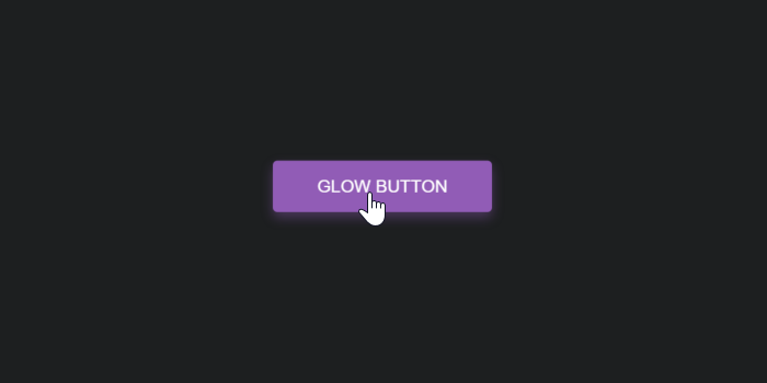
Glow button examples
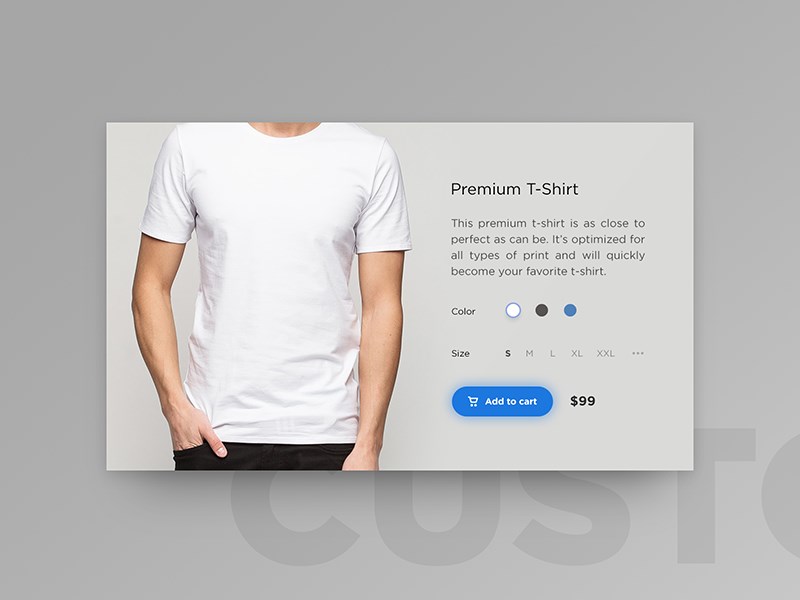
The original visual reference was posted on Dribbble by Denis Abdullin. The glow is a styling enhancement, not a replacement for a clear label or visible interaction states.
Add a CSS glow to a button
Use a native <button> for an action on the current page. Give it a useful text label, and set its type explicitly: use type="button" for an ordinary action and type="submit" when it submits a form. This avoids an unintended form submission when the button is inside a form. See MDN's guide to the HTML button element.
<button class="glow-button" type="button">Save changes</button>
The base style makes the control usable before hover or focus. box-shadow adds the glow; the :hover rule is an enhancement for pointer users, and :focus-visible adds a distinct outline when a keyboard user moves focus to the button.
.glow-button {
  display: inline-flex;
  align-items: center;
  justify-content: center;
  padding: 0.75rem 1.25rem;
  border: 0;
  border-radius: 0.375rem;
  background-color: #5432a8;
  color: #fff;
  font: inherit;
  font-weight: 600;
  cursor: pointer;
  transition: box-shadow 180ms ease, background-color 180ms ease;
}

.glow-button:hover {
  box-shadow: 0 0 1rem rgb(84 50 168 / 45%);
}

.glow-button:focus-visible {
  outline: 3px solid #1f2937;
  outline-offset: 3px;
  box-shadow: 0 0 1rem rgb(84 50 168 / 45%);
}

.glow-button:active {
  background-color: #422587;
}

@media (prefers-reduced-motion: reduce) {
  .glow-button {
    transition: none;
  }
}
The :hover selector is not a reliable interaction state on touchscreens: browsers handle it differently, and some devices have no hover-capable pointer. Keep the label, background, and other essential cues visible at rest. The :hover reference describes these touch-device differences.
Do not remove the focus outline. Choose an outline color that stands out against the page behind the button; the dark outline in this example assumes a light background. Check both the button text and focus indicator against their adjacent colors, following the WCAG contrast guidance for text and non-text controls. MDN also explains its focus-visible pseudo-class.
The transition is decorative, so the prefers-reduced-motion media query removes it when a user has asked the operating system for less motion. See the MDN reference. To keep a glow visible all the time, add this modifier; retain a clear focus outline as well:
.glow-button--always {
  box-shadow: 0 0 1rem rgb(84 50 168 / 35%);
}
Adjust the shadow color and blur to fit the surrounding design. The MDN box-shadow reference explains its offsets, blur, spread, and color. If the glow is cut off, check whether an ancestor clips its contents with overflow: hidden.
Original glow button demo
The embedded demo is the original hover-only example. The code above adds keyboard focus and reduced-motion handling for a current implementation.
See the Pen Glow Buttons with CSS by Kanishk Kunal on CodePen.
For more button styles, see the CSS button effects collection, 3D CSS button, and ghost button CSS.

Nice. Great work. Thanks for sharing. I learned a lot.