Unfortunately, font combinations don’t grow on trees. If only it was that simple. They make the font world go round, but they can be quite the challenge to put together. However, when put together correctly, font combinations are like power couples. They translate your brand’s message accurately and enhance it, making your brand message even more effective. The trick is knowing how to pair them in the best way to bring you the best results.
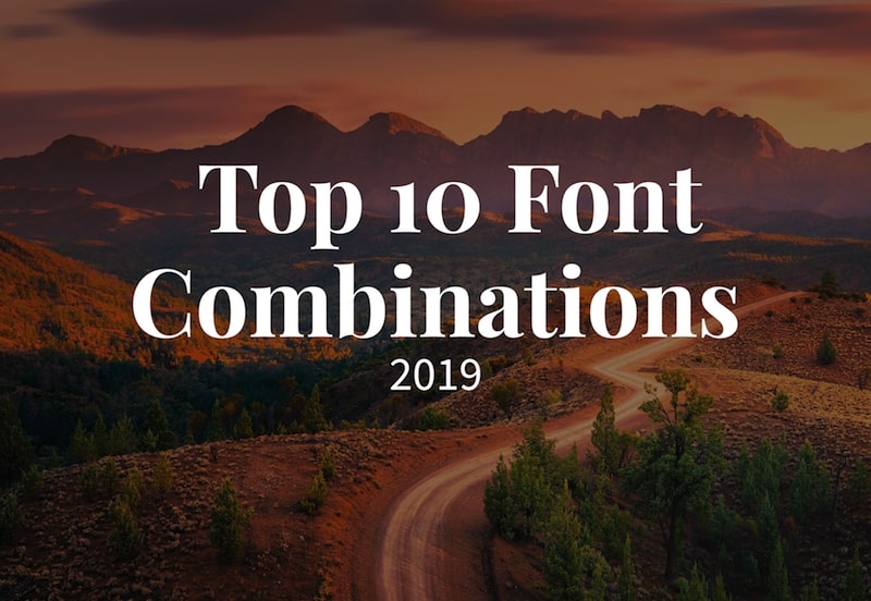
Leave that up to us! With the 10 best font combinations by Bold Web Design listed below. All these fonts are free and are available to download from Google Fonts.
Playfair Display with Source Sans Pro
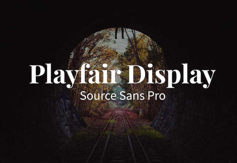
The extrovert meets its perfect introvert. With contemporary characteristics to a traditional style, Playfair Display adds a classy turn to the serif font. This font stands out from the others, and pairs extremely well with a simpler sans serif font like Source Sans Pro – both projecting a modern style!
Merriweather with Oswald
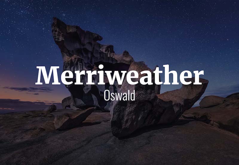
Who said traditional had to look old? Merriweather has a old school style that highlights wise features and brings a feeling of trustworthiness. While Oswald is very straight lined and practical, its narrow font also makes it great if you have to fit a lot of text in a small area.
Elsie with Roboto
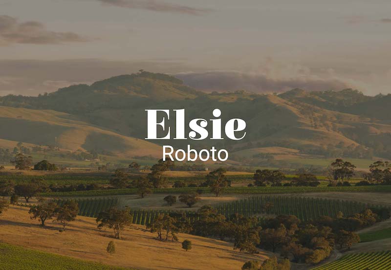
With a quirky feminine style, Elsie adds personality to your content – all with a touch of elegance. Notice the thick lettering compared to its duo Roboto? These fonts work particularly well together because they are opposites! Compared to Elsie, Roboto is extremely tame and an all around much quieter font.
Montserrat with Merriweather
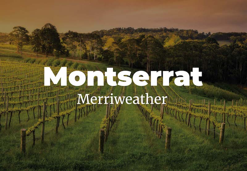
What’s a better duo than peanut butter and jelly? Wine and cheese. They both have age, but one is wise beyond its years and the other is a snack for all. Montserrat is the cheese, with clean lines that almost resembles the look of a bubble letter. Merriweather represents the wine, as its traditional aspects make it better with age.
Raleway with Lato

So you’re looking for some versatility? You’ve come to the right font combination. Raleway and Lato are about as straight forward as one could get when dealing with fonts. Think of them as the digital age’s default. They show up well on the web, due to their crisp features, and elevate your content up to sophistication.
Dancing Script with Josefin Sans
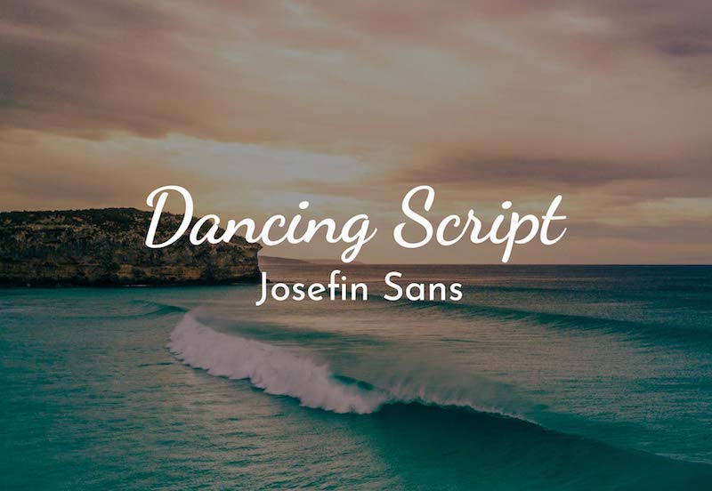
Remember when schools made cursive writing mandatory? Oh, how the times have changed, but not fonts in this case! Script fonts, similar to the look of cursive writing done by someone with a great hand, portrays personability and elegance. It’s light and airy, just like its pair Josefin Sans. With Dancing Script as the main attraction, Josefin Sans enforces the modernity and keeps the two balanced with its versatile and straight character lines.
Abril Fatface with Roboto
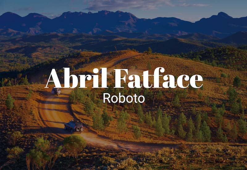
Quirky at its finest, Abril Fatface is sure to stand out from any other serif font. This unique and contemporary font has a mix between thick and thin details, ensuring your website content will stand out. It pairs well with the simple Roboto, a thin sans serif font.
Alegreya with Open Sans
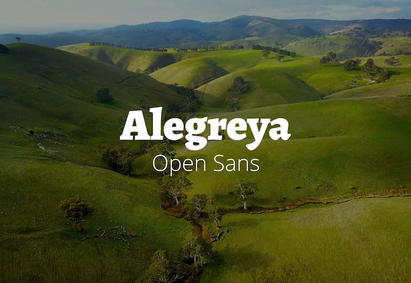
Play that funky music, Alegreya! Life’s too short to be serious, and you bet Alegreya portrays that. Its geometric letters with differing widths add spunk to any title or heading. However, we all need that practical partner to tie us down, and that’s Open Sans. Crisp and modern, it compliments rather than competes with Alegreya.
Work Sans with Roboto
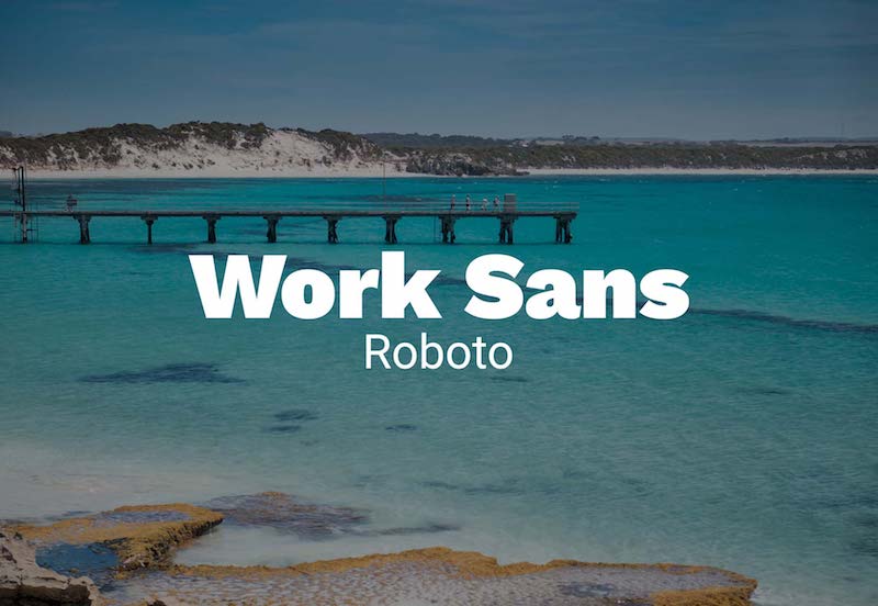
What’s big, bold, and loud all over? Work Sans! This font is inviting and clear. With a sense of personability, Work Sans comes across as more informal. Want to relate to your reader? This will do the trick. Coupled with an all time favorite, Roboto, you can guarantee your text will be easily read.
Palanquin with Roboto
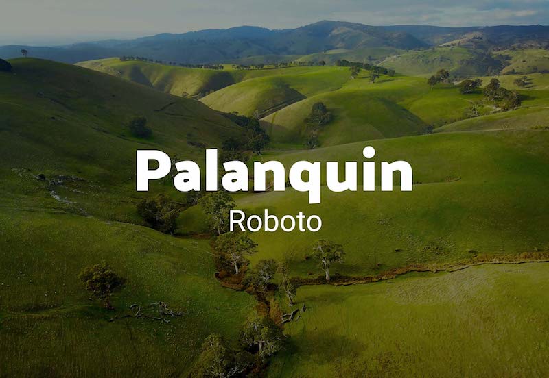
You know that person that can pull off many different styles? That’s Palanquin. Available in many different weights, this font was designed for digital. With straight lines and diagonal ends, this gives it a fun alternative to any other sans serif font. Of course paired with the trusty Roboto, exhibiting simple lines, as it lets its partner take the spotlight.
Conclusion
Those are just the top font combinations we see, but that doesn’t mean there aren’t a million more out there! Font combinations can be made by whichever two fonts you think work well together.
The general rule is sans serif fonts pair well with serif fonts, and louder fonts pair better with quieter fonts. Opposites really do attract in the case of fonts. If you’re still feeling stuck, don’t worry. Choosing a font, or two, is a big decision! Fonts can change the mood of the reader, make a message more effective, or change the image of a brand. While it may seem like a small detail, it has a large impact!
