
In the fast-paced realm of online shopping, where attention is brief, the simplicity of website navigation becomes crucial for e-commerce success. Businesses aim to enhance the online shopping experience, emphasizing the vital role of an easy-to-use navigation bar.
Let’s delve into the impact that user-friendly navigation has on e-commerce outcomes, exploring the intricacies of user experience (UX) and the key elements of effective navigation.
What is Website Navigation and Its Importance
Website navigation encompasses the structure and system that allows users to move through different pages and content within a website. It typically includes menus and links strategically placed for easy access to various sections.
A well-designed navigation system enhances user satisfaction and the likelihood of visitors spending more time exploring the content. It also plays a vital role in search engine optimization, as search engines assess a website’s structure to determine relevance and authority.
Well-optimized navigation can significantly boost sales by providing a positive user experience, increasing engagement, and facilitating a smooth path for visitors to find and purchase products or services.
In essence, website navigation is a cornerstone of web design, impacting user experience, engagement, and the overall success of a website.
Types of Website Navigation Bar
Website navigation bar comes in many forms, but let’s focus on five popular ones. Let’s break down these common types and see how they make it easy for you to explore and use websites.
Layered Navigation
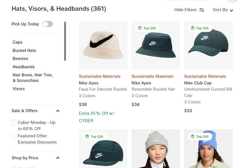
Layered Navigation, characterized by its dynamic product filtering capabilities, empowers users to tailor their online shopping journey with precision. This feature enables the seamless refinement of search criteria, offering a personalized exploration of product categories, brands, and price ranges.
Additionally, some e-commerce platforms, such as Magento 2, incorporate Ajax product filtering. This serves as an instance of layered navigation designed to update the product list instantly without reloading the page. It works well with big databases and can be shown in the top toolbar (horizontal layered navigation) or left sidebar (vertical layered navigation).
Its design ensures a minimalist aesthetic, adapting seamlessly to both desktop and mobile interfaces. This inclusion reflects a commitment to enhancing user experiences by providing a sophisticated and customizable navigation tool. Ultimately, the layered navigation contributes to a unified and consistent journey across diverse devices, ensuring a seamless and personalized exploration for users.
Header Navigation
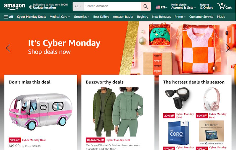
Header navigation is one of the most common and essential forms of website navigation. Typically located at the top of the webpage, the header contains links to the main categories or sections of the website. It serves as a roadmap for users, allowing them to quickly access key areas of the site.
Header navigation often includes dropdown menus that provide additional options or subcategories. This type of navigation is user-friendly and intuitive, making it a go-to choice for a wide range of websites, from e-commerce platforms to informational websites.
Footer Navigation
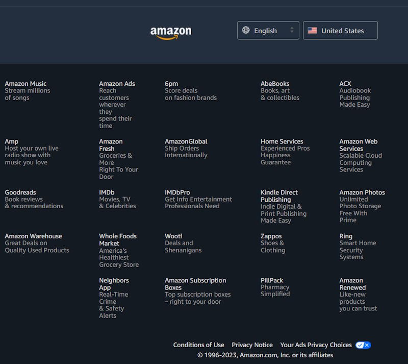
Found at the bottom of the webpage, footer navigation complements the header by offering links to important pages such as the privacy policy, terms of service, and contact information. It acts as a secondary navigation system, providing users with access to essential information regardless of their position on the page. The footer may also include a sitemap, offering a comprehensive list of links to all pages on the website. Footer navigation contributes to a well-rounded user experience, especially for users who prefer to scroll to the bottom for additional resources or details.
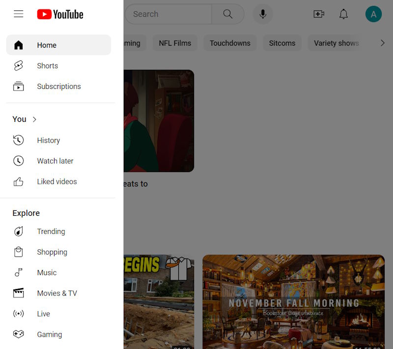
Hamburger Menu
The hamburger menu has become increasingly prevalent, especially in responsive and mobile-friendly designs. Recognized by its three horizontal lines, this menu is often tucked away in the corner of the screen. When clicked or tapped, it reveals a menu with navigation options. The hamburger menu is a space-saving solution, allowing websites to maintain a clean and minimalist appearance, particularly on smaller screens. While it started as a mobile design element, it has made its way into desktop interfaces as well, contributing to a unified and consistent user experience across different devices.
Breadcrumb Navigation
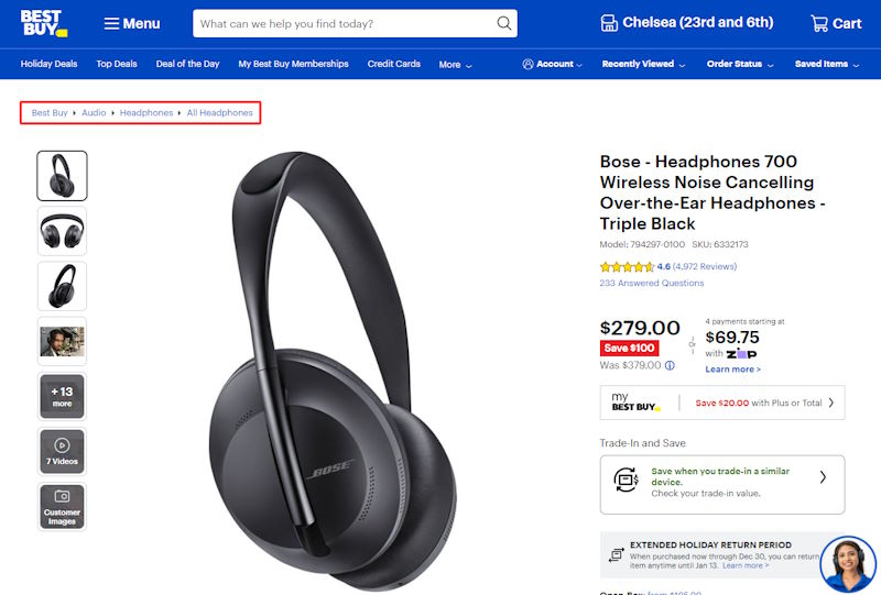
Breadcrumb navigation is a trail of clickable links that indicates the user’s location within the website’s hierarchy. Typically displayed horizontally at the top of the content area, breadcrumbs show the user the path they have taken to arrive at the current page. This type of navigation is especially useful for websites with deep content structures or e-commerce platforms with numerous product categories. Breadcrumbs improve user orientation, allowing them to backtrack or jump to higher-level categories easily. It enhances the overall user experience by providing context and aiding navigation, making it a valuable addition to websites with intricate page relationships.
How Does the Effective Website Navigation Structure Looks Like
Crafting an effective website navigation structure involves careful consideration of several key elements.
Firstly, the primary navigation menu should be prominently placed at the top of the page, utilizing clear and concise language to highlight key sections. This serves as the backbone for users to navigate through the website.
Content organization is equally crucial. Related content should be logically grouped, and the use of submenus and dropdowns can help prevent overwhelming users while reducing cognitive load. This ensures that users can easily find and access the information they are looking for.
User-friendly labels play a significant role in enhancing user comprehension. Intuitive language makes it easier for users to understand the purpose of each section, contributing to a more user-friendly experience.
The integration of a search bar with effective functionality is another important aspect. This feature caters to users who prefer searching for specific information, providing a quick and efficient way to access content.
A responsive design is essential for accommodating users on various devices. Visual cues, such as icons, guide users and maintain design consistency, creating a seamless experience across different platforms.
Finally, the navigation structure is a dynamic element that evolves over time. Regular testing, analysis of user feedback, and periodic updates aligned with changing content and design trends are essential for keeping the website navigation current and effective. In summary, an effective website navigation structure is a holistic approach that prioritizes user needs, simplicity, and adaptability, creating a seamless and user-friendly digital environment.
How to Improve the Website Navigation
1. Simplicity is Key
A clutter-free and straightforward navigation bar is essential for an optimal user experience. A concise menu with clear language helps users quickly understand the available options. Overloading the navigation bar with too many items can overwhelm visitors, potentially leading to frustration and a higher likelihood of users leaving the site. Prioritize simplicity to ensure users can easily find the information they’re seeking without unnecessary distractions.
2. Hierarchy and Organization
Organizing menu items hierarchically is crucial for guiding users through the website seamlessly. Submenus can be employed to categorize related pages, creating a logical structure. This hierarchy aids users in understanding the relationships between different sections of the site and allows for more efficient navigation. Placing high-priority pages prominently in the navigation ensures that users can access the most important content with minimal effort.
3. Visual Cues
Visual elements such as icons and arrows play a significant role in enhancing the user experience. Icons can serve as intuitive indicators for specific types of content or actions, making navigation more visually appealing and user-friendly. Highlighting the current page or section helps users maintain context within the site, reducing the chances of confusion and improving overall navigation efficiency.
4. Descriptive Labels
Clear and descriptive labels for menu items are crucial for user comprehension. Users should be able to discern the purpose of each navigation option without ambiguity or confusion. Avoiding jargon and industry-specific terms ensures that the language used in the navigation aligns with the users’ understanding, making the website more accessible to a broader audience.
5. Search Functionality
Integrating a search bar into the navigation provides users with an alternative and efficient method for finding specific information. A well-implemented search functionality should deliver relevant results quickly, enhancing the overall user experience. This feature is particularly valuable for users who prefer searching rather than navigating through menus, contributing to a more inclusive and accommodating website design.
6. Consistent Design
Consistency in design, including colors, fonts, and styles, is paramount for creating a cohesive and visually pleasing user interface. A uniform design throughout the website, including the navigation bar, fosters a sense of familiarity. Users should be able to recognize and understand the navigation structure, regardless of the page they are on. Consistency contributes to a professional and trustworthy website image.
7. Accessibility
Prioritizing accessibility ensures that the website is usable by individuals with disabilities. Proper HTML markup, alternative text for images, and adherence to accessibility standards contribute to a more inclusive experience. Testing the website with screen readers helps identify potential issues and ensures that users with visual impairments can navigate and comprehend the content effectively. By making accessibility a priority, the website becomes more welcoming to a diverse audience.
Conclusion
In the ever-evolving realm of online shopping, the exploration into the intricacies of user experience and effective navigation underscores the pivotal role of website design in e-commerce success. From classic header navigation to modern options like hamburger menus and breadcrumbs, each element contributes to a seamless user journey, impacting satisfaction and engagement.
A well-designed navigation structure, characterized by simplicity, hierarchy, visual cues, and consistency, creates an environment where users effortlessly find what they need. Incorporating search functionality and prioritizing accessibility further enhance the user experience.
In essence, the website navigation bar is not merely a navigational aid but a dynamic component that evolves through testing and user feedback. As businesses navigate the ever-changing e-commerce landscape, the significance of user-friendly navigation remains a constant force shaping the success of their digital endeavors.