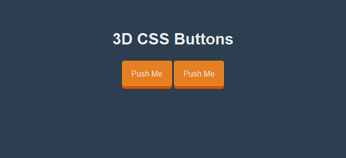
While I love flat web design, however sometimes little things like 3D CSS buttons when combined with otherwise flat design do look much more appealing to the eye. The idea is to emphasize call to action with a 3D effect on these buttons.
Many flat design websites as well as apps and games (such as threes) make use of 3D buttons in their interface. A 3D button when clicked or tapped, displays the characteristics of being pushed downwards in a 3D manner. In this post, I will show how I created such 3D buttons myself with CSS for a cross-platform hybrid app that I am working on.
Create 3D CSS Button
The HTML we have, simply contains the links that we want to convert into 3D buttons. We will apply a class button-3d to them which we will define in the CSS.
<a href="#" class="button-3d">Push Me</a>

<!--Links with button-3d class applied with convert into 3D buttons-->
The CSS
In the CSS, we are going to first define the class button-3d which will give button the 3D look. Much like what we did for our ghost buttons, we will first give some amount of padding for the button and remove default text-decoration for the link. We will also define its background color and border color (a bit lighter shade than the background color). For giving the actual 3D look, we will apply a box shadow with a color of darker shade than the background color. You may notice that I have chosen flat ui colors here.
.button-3d {
  position:relative;
  width: auto;
  color:#ecf0f1;
  text-decoration:none;
  border-radius:5px;
  border:solid 1px #f39c12;
  background:#e67e22;
  text-align:center;
  padding:16px 18px 14px;

  -webkit-transition: all 0.1s;
  -moz-transition: all 0.1s;
  transition: all 0.1s;

  -webkit-box-shadow: 0px 6px 0px #d35400;
  -moz-box-shadow: 0px 6px 0px #d35400;
  box-shadow: 0px 6px 0px #d35400;
}
CSS for Push Button effect
Next we will define the push button effect in the CSS active selector of our button-3d class. You will notice that we are reducing the box shadow and moving the button down a bit by defining the top attribute. By doing this a push style effect is generated, where the button moves down and its shadow decreases. Also note that, when we defined our button-3d class, we added transition duration of 0.1s, this allows a gradual shift (animation) of button downwards over a duration of 0.1s instead of an abrupt shift.
.button-3d:active{
  -webkit-box-shadow: 0px 2px 0px #d35400;
  -moz-box-shadow: 0px 2px 0px #d35400;
  box-shadow: 0px 2px 0px #d35400;
  position:relative;
  top:4px;
}
In case you are creating 3D buttons of different sizes or with different box-shadow height, make sure to keep the sum of box-shadow height and top attribute in the active state same as the box-shadow height for normal state. For our case this was 6px.
Demo of 3D Buttons with CSS
View the demo and the full code in action for the 3D buttons.
See the Pen 3D CSS Button by Kanishk Kunal on CodePen.
More Button Effects
You can find more such effects in this list post of creative button effects. I have also made demo of glow button effect in CSS.
Nice 3d buttons thanks
wonderful. thank you.