A usable app offers an excellent user experience, and great user experience leads to happy customers. Satisfy and delight your app users, rather than annoying them, by avoiding ten app design mistakes.
Let’s kick things off with mistake #1.
Mistake #1: Poor consideration of thumb zone
It’s undeniable that users are most comfortable using hand positions, convenience, and physical limitations. The term “Thumb zone” is an important factor in the design and development of mobile interfaces. According to Steven Hoober, a famous author of Designing Mobile Interfaces, “The Thumb Zone” is the most comfortable area for touch with one-handed usage. Around 49% of users hold their phones in one and use it with one thumb. Moreover, 75% of interactions are thumb driven.
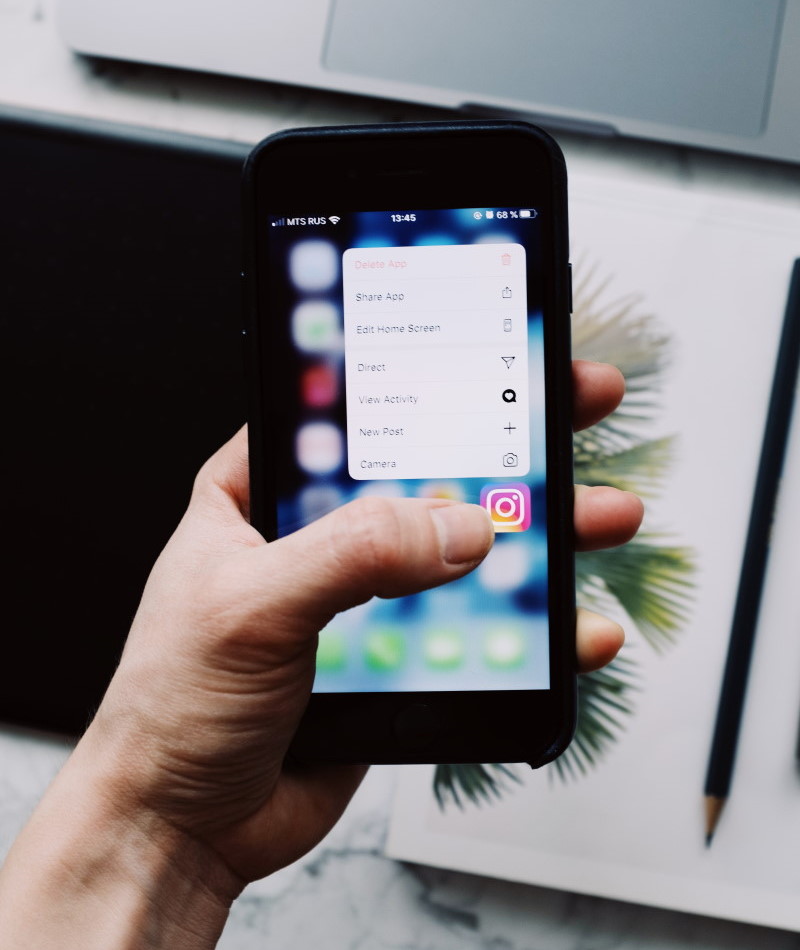
With the understanding of hand placements, we can conclude that thumb movement can be divided into three parts: easy-to-search, hard-to-react, and in-between areas.
Many designers usually give this mythical zone inadequate consideration, and they underestimate this important mantra to follow. Considering “thumb zone” helps to create human-friendly experiences and to get less headaches. It also provides tapping controls at a place where users can easily up them using thumb.
Mistake #2: Design Inconsistency
Consistency is a key principle in design. It is one of the design principles that is violated frequently by many. In design, consistency means the font type, colors, buttons, and elements should be the same within the whole application. In short, visuals are important! Colors, typography, space, grid, size, and positions are elements that need to be defined in one central place. Then, these elements should be used across the system you are designing. Plus, the layout should be subtle; all icons should be placed in a manner and correctly and changing screens should change the visuals. Not only this, but the text should be readable throughout the app.
For maintaining consistency, you need to take care of: Visuals, make use of familiar patterns and keep the voice and tone consistent. It helps in enhancing user experience of the app and also prevents users getting confused.
Mistake #3: Excessive use of modal pattern
Several apps use modal windows (an element that sits on top of an app’s main window) for implementing interactions with data in terms of adding a new item, editing an existing item, or even reading additional information about an item. Modals can be seen on top of the current page, and the background content is generally dimmed.
Alas! If there’s excessive use of modals, it can reduce the visibility of contexts by covering up the information, which users may want to refer to while filling out the form. To avoid this, here’re some guidelines that you need to follow for using modal window:
- Use it only for important warnings as a way to prevent or correct errors.
- Use it only to request the user to enter critical information to continue the current process.
- Use it to ask for information that could significantly lessen a user’s work or effort.
- Avoid using modal dialogs for non-essential information that is not related to the current user flow.
Mistake #4: Misusing Notifications
Push notifications are recognized as an “overly critical” part of app design best practices. They are as important or even more than the rest of the app’s UX. This is because – push notifications to remind users about installed and new updates. In case, too many notifications, users usually turn them off most probably. Too few, it also affects your app. However, it’s not just the frequency of notifications that can turn users on or off. Useful notifications like notifying users of a new message or reminding them to make a daily check-in are seen as helpful and necessary.
Notifications are like micro interaction, which is all about enhancing user experience and strengthening the overall usefulness. However, misappropriation of using notifications can prompt users to delete the app altogether.
Pro tip: To effective use of push notifications, don’t send them in bursts. All you need to make it easy to turn them off.
Here’re a few best practices for push notifications that can be thought of four pillars: make them timely, relevant, precise, and implement them correctly.

Mistake #5: Complicated Interface
Even though the purpose and end goals are important, they become unrelated if not directed within the proper context. Designers may find UI seamless at first glance, but first-time users from diverse backgrounds may not find it intuitive. The goal of an application should be to facilitate a more engaging and seamless user experience when designing an intuitive and personable user interface.
Here’re some traits that are responsible for bad UI:
- Sluggish & unresponsive – interaction will be slow and clunky.
- Inconsistent design – pages will look different that throw users off.
- Confusing – It could be unclear about where the visitors should go next.
The interface should be simple, scannable, and easy to understand. Uber’s interface is a perfect example of a simple UI because when a user needs to book a ride, it barely interrupts conversation. In reality, Uber hides a lot of support content within the app.
All you need to consider the following points carefully to while mapping out app’s UX flow:
- Is the application meant to be accessed for a short time period?
- Does the app use a lot of content that allows users to stay a while?
- How will design help to convey the message to users?
Mistake #6: Unlabeled Icons
The first job of icons is to guide users where they need to go while using a mobile app. Icons are self-explanatory for users. However, sometimes, icons are not always familiar to users as UX practitioners would expect. It could be worse if app icons are so unique to be predicted by users. Icons can also cause usability problems when designers hide functionality behind icons, which are hard to recognize.
According to a series of tests of UserTesting, comparing labeled icons to unlabeled icons, and found that –
- When users tapped on labelled icons, 88% of users were able to predict what would happen in the app.
- On the other hand, that figure dropped to 60% for unlabeled icons.
- Users also correctly predicted what would happen, they tapped an icon only 34% of the time.
In short, including universal icons with labels is the safest option and can prevent users from being abandoned.
Mistake #7: Touch elements are too tiny (or too close)
Mobile with small touch elements is harder for users to hit than larger ones. While designing mobile interfaces, it’s best to make targets big enough so they are easy for users to tap. In short, too close elements to tap without zooming can be a problem for users. You need to ensure that there must be plenty of space around each element for eliminating inadvertent clicks.
Mistake #8: Poor Feedback Loops
People who study human behavior agree that feedback loops play a critical role in what designers do in building products. No matter how good the product is, it must be full of feedback loops. Designing for behavior change can enhance user engagement, create business value and improve lives.
Feedback loops are all about interactions that should be met with an equal and opposite reaction. Whatever designers are designing, it most probably requires feedback.
It lets users have a sense of control while engaging with an app. Also, it provides you valuable information about how users interact with an application. It helps users to make decisions and make the interface easy. Feedback loops can be improved with any of these aspects: speed, context, measurability, and connections to motivations. Therefore, the feedback loops should:
- Tell users what is going on or what should happen next, for example, navigation arrows or loading progress wheel.
- Show the user’s current state, for example, hover state color change.
- Respond when an action is executed, for example, success notification when a form is submitted.
Mistake #9: Underusing app beta testing
It is pivotal for designers to understand the use of apps with some feedback loop to learn what is and isn’t working. There’s a common mistake is in-house testing done by designers while doing beta testing. It is recommended that before going public or use any testing service like UserZoom before going public. It can be a great way to get the details, edit down features, and find out what’s missing. Beta testing can be time-consuming, but it’s an alternative to developing an unsuccessful application.
To avoid this, designers should follow best practices for mobile app design. Therefore, it will surely help to create an app that stands out.
Mistake #10: Disregarding app development budget
Once the basic features and functions of an application are sketched, it would be better to discuss the budget with the development team. Doing this prevents spending a considerable time designing features and UX patterns that need to be cut. Plus, the development team does not have the resources to implement them.
It’s all-essential to learn the average costs of app development. The budget should be important and useful design constraints to work within, rather than disregarding it.
Conclusion
It’s important to acknowledge how competitive the mobile app market is and prepare your app to stand it from others on the app store. Being a designer, you need to have a logical vision of what mobile app is hoping to achieve.
If you want to share your thoughts on app design mistakes, do comment below. We’d love to hear from you!