
Bootstrap 5 is a breaking upgrade from Bootstrap 4, not just a new set of styles. The biggest changes affect JavaScript dependencies, browser support, data attributes, Sass customization, and the migration work needed in existing applications. The Bootstrap project currently lists v5.3.8, released on August 26, 2025, as its latest release.
This guide compares Bootstrap 4 with the current 5.3 line; check the release list before starting an upgrade because newer patches may be available.

Bootstrap 5 vs Bootstrap 4 at a glance
| Area | Bootstrap 4 | Bootstrap 5 |
|---|---|---|
| JavaScript | Bootstrap's JavaScript plugins depend on jQuery and Popper 1. | Bootstrap's plugins use native JavaScript; components such as dropdowns and tooltips use Popper 2. |
| Browser support | Supports older browsers, including Internet Explorer 10 and 11. | Drops Internet Explorer 10 and 11 and other legacy browser versions. |
| Data attributes | Uses attributes such as data-toggle and data-target. |
Uses the data-bs- namespace, such as data-bs-toggle and data-bs-target. |
| Layout | Includes the standard responsive grid and spacing utilities. | Adds an xxl breakpoint, grid gutter utilities, expanded utilities, and an optional CSS Grid system. |
| Forms and components | Includes the v4 form classes and component set. | Updates form classes and adds components such as offcanvas, accordion, and placeholders. |
| Theming | Sass-based customization. | Adds component CSS variables; Bootstrap 5.3 also supports opt-in color modes. |
The official migration guide documents breaking changes between major versions. Review it alongside this summary before changing an application.
JavaScript no longer requires jQuery
Bootstrap 4's interactive plugins rely on jQuery. Bootstrap 5 removed that dependency and uses native JavaScript, which avoids loading jQuery solely for Bootstrap. It does not prevent your own application from using jQuery.
Popper is still used for positioning features such as dropdowns and tooltips. The Bootstrap JavaScript bundle includes Popper; if you load individual files, follow the JavaScript setup instructions and include the dependencies required by the components you use.
Bootstrap 5 also renamed its JavaScript data attributes. For example, update markup like this:
<!-- Bootstrap 4 -->
<button data-toggle="collapse" data-target="#details">Details</button>

<!-- Bootstrap 5 -->
<button data-bs-toggle="collapse" data-bs-target="#details"
        aria-expanded="false" aria-controls="details">Details</button>
Check templates and dynamically generated markup as well as your page files; an old attribute name can leave a control looking correct but no longer interactive.
Bootstrap 5 also moves to Popper 2. If you configured tooltip, popover, or dropdown positioning, check the migration notes: fallbackPlacement became fallbackPlacements, and offsets are configured through popperConfig rather than the old offset option.
Browser support is narrower
Bootstrap 5 dropped Internet Explorer 10 and 11 and older browser versions. That lets the framework use newer CSS and JavaScript features, but it can be a blocker for apps with a contractual or user-driven legacy browser requirement. Check the current Bootstrap browser support policy against your own support matrix rather than assuming every modern browser version is covered.
For a new project, use the current Bootstrap release unless you have a specific compatibility reason not to. For an existing Bootstrap 4 application, keep v4 temporarily if its browser or dependency constraints require it, and plan the migration when you can test the whole interface.
Layout, utilities, and Sass changes
Bootstrap 5 adds an xxl grid breakpoint and gutter utilities such as .g-3. Its default grid remains flexbox-based; an optional CSS Grid system is available when you explicitly opt in. The Utility API lets Sass users generate or customize utility classes instead of maintaining every variation by hand.
Directional utility names changed to support right-to-left layouts. For example, .ml-3 and .mr-3 become .ms-3 and .me-3; left/right alignment, borders, and padding utilities have similar start/end renames. Search your templates and stylesheets for these names during migration.
Bootstrap 5 also provides more CSS custom properties. In 5.3, color modes can be selected with data-bs-theme on the document or a component, which is useful when you need a dark theme without maintaining a separate framework build. Read the CSS variable and color mode docs before layering your own theme variables over Bootstrap.
Bootstrap's expanded palette can be a starting point for a custom theme. A color shades generator can help you explore related shades, but check contrast and focus states in your actual interface rather than relying on color swatches alone. If you prefer a utility-first approach, compare the workflow with Tailwind CSS; the two frameworks organize styling differently.
Forms and components
Bootstrap 5 revised form markup and styles. For example, .custom-select became .form-select, .custom-range became .form-range, and custom checkbox and radio controls use the .form-check pattern. Review the migration guide before changing customized forms, since class renames and removed options can affect both layout and validation.
The .form-group, .form-row, and .form-inline layout helpers were removed; use grid and spacing utilities to compose form layouts instead.
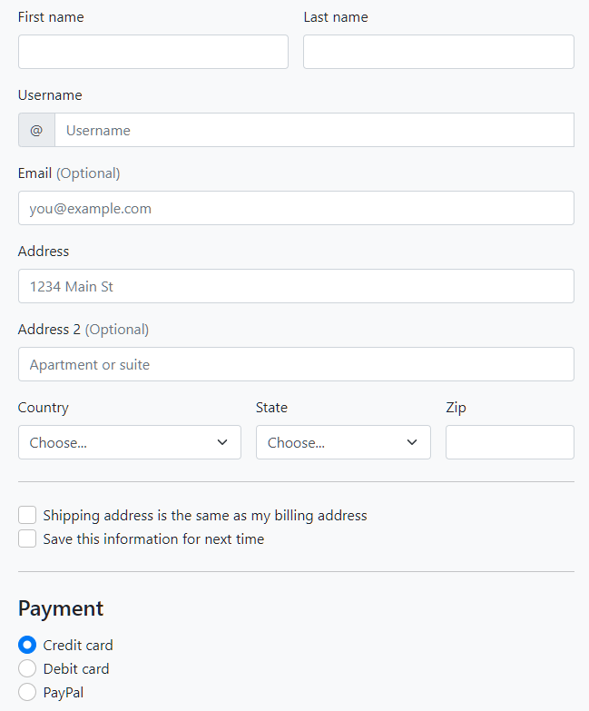
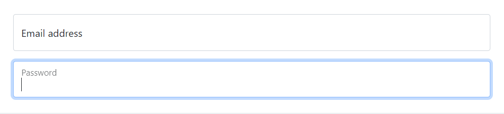
Floating labels are available for supported text inputs and selects. Their appearance is one option among many; projects considering a material-style interface can also review these Material Design UI frameworks and MDB.
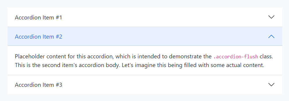
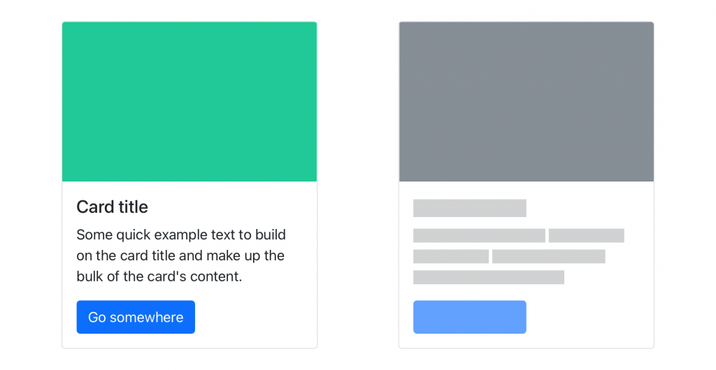
Bootstrap 5 also added or expanded components that are useful in common layouts:
- Offcanvas panels can hold navigation or secondary content that opens from the edge of the viewport. See the offcanvas and navbar documentation.
- Accordion groups organize expandable sections, while the loading-state component can indicate that content is being fetched. See the accordion and loading-state examples.
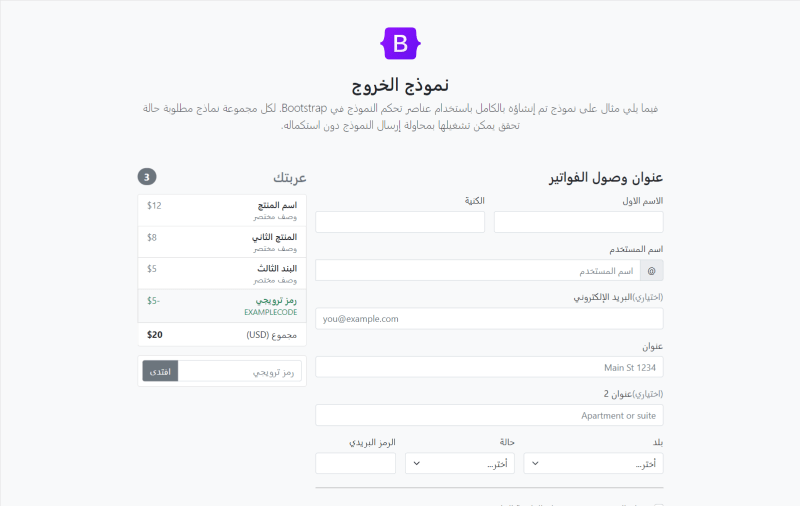
- Right-to-left support includes RTL stylesheets and documentation. If you support languages written right to left, start with the RTL guide and RTL examples; the RTL overview explains the writing direction.
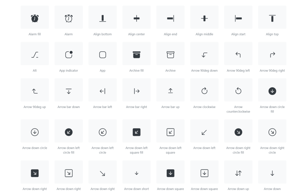
Bootstrap Icons are maintained as a separate icon library rather than bundled into Bootstrap's core CSS. Browse the Bootstrap Icons library and include only the icon assets your project needs.
A practical Bootstrap 4 to 5 migration checklist
- Check dependencies first. Record the Bootstrap version, jQuery and Popper usage, themes, plugins, and any component markup generated by your app. Confirm that each dependency supports Bootstrap 5.
- Update the framework and build. Follow the current installation and Sass customization guidance. Revisit Sass variable overrides and utility generation rather than assuming a v4 theme compiles unchanged.
- Update markup and scripts. Rename
data-*attributes todata-bs-*, migrate changed component and utility classes, and remove Bootstrap-specific jQuery plugin calls. Keep jQuery if other parts of your app still depend on it. - Check layout and direction. Review grid breakpoints, gutters, start/end utilities, RTL styles, and any custom CSS that depended on old class names.
- Test real user flows. Exercise navigation, dialogs, dropdowns, forms, validation, responsive layouts, keyboard use, and the browser versions you promise to support. A successful Sass build alone does not verify a migration.
Should you keep Bootstrap 4 or move to Bootstrap 5?
For a new site, Bootstrap 5 is the practical starting point: it removes Bootstrap's jQuery dependency and receives current framework changes. Confirm the latest supported release and browser policy when you choose a version.
An existing Bootstrap 4 site does not need a rewrite simply because Bootstrap 5 exists. Upgrade when you need a newer component or customization feature, when your dependencies are ready, or when you can budget time for regression testing. Keep v4 only while a real compatibility constraint requires it, and avoid mixing v4 and v5 CSS on the same pages unless you have a deliberate migration plan.
If you use Bootstrap to launch a site quickly, compare these Bootstrap templates, admin templates, and UI kits. You can also browse the team's Bootstrap templates on TemplateFlip.
For project setup, use the current Parcel guide instead of the archived Bootstrap 4 npm starter. For other responsive frameworks, see this responsive CSS framework comparison.

Awesome article.
I find this article very comprehensive and useful.👍
Thanks for sharing.
It will be great if all breaking changes are also listed. But with what you’ve mentioned, I think I’m gonna stick with bs4. I can still use vuejs with jquery with no hassle. Thanks for the information.
Thank you very much for the information. The next project will be realized with bootstrap 5 – I am exited if the performance gets even better.
Awesome article.
that’s wonderful!
Very helpful
I found the comparison very helpful, thanks.
Awesome article.
This article was very helpful for me!
How about the drop of support for visibility classes and their awful replacement?
Helpful article! Caught this in #15: “Thus all data attributes in Bootstrap 5 not contain bs as an infix.” Should it be “now”?