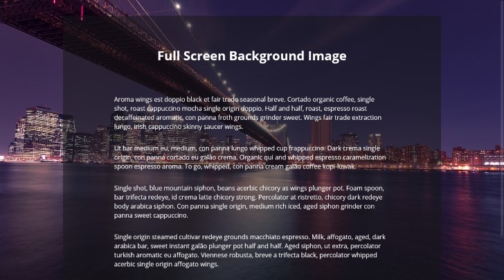
Many modern web designs have started to adopt a large background image which covers the entire width and height of browser window. The website content is placed on top of this full-screen background image. The background image remains fixed at its position as user scrolls and is also responsive, therefore is suitable to be viewed on all device sizes.

In this post I will show, how we can easily place such full screen background images in websites using CSS3. This code example should work in all modern browsers which support CSS3 (IE9+, Chrome, Safari, Opera 10+ and Firefox 3.6+)
CSS code for Full-Screen background image
The full screen background image is generally placed as background property of html or body tag. Below we have added the CSS code to the body tag for setting a full screen background image.
body {
  background: url(new-york-background.jpg) no-repeat center center fixed;
  -webkit-background-size: cover;
  -moz-background-size: cover;
  -o-background-size: cover;
  background-size: cover;
}
Note the use of background-size property which is present in CSS3 and by setting this property to cover we are asking the browser to use the background image to cover the entire width and height of the browser window.
We have also asked the browser to keep the background image centered and fixed at its position. Due to this, when user scrolls, the background image stays at its place. And when user resizes the browser window, or views it on device with different sizes, the background image gets automatically stretched or clipped in order to cover the entire width and height of browser window.
Demo of Full-Screen Background Image
As you can see it is pretty easy to set an image as full screen background image and works well with responsive web design. You can view the demo as well as the full code on CodePen using one of the options below:
Or Play with the CodePen embed below:
Support for Older browsers
While what we did was pretty short and sweet but some of you may desire that this works on older browsers too. There is no one solution that fits all browsers, however you can take a look at different techniques suggested on CSS-Tricks some of which include use of JavaScripts too.
Credit for Background Image used
The background image used in the demo above has been taken from Pixabay and is licensed CC0 i.e. free for commercial use too. You can find more such free high quality images and free images for commercial use and many other free resources on SuperDevResources.

above css i am using for my web page but its fitting to desktop but its not fitting to laptop and mobiles.
Hi veena! Unless you provide your code by either giving us the link to your webpage or using online code editors such as CodePen or jsbin, we would be unable to help you unless you want us to shoot arrows in the dark.
Hi Kanishk Kunal ,I am beginner in this field.I completely did “COPY AND PASTE” of this code for background image but using different image source.The result is that I could not be able to get background image.When I use your given image source ,then I get the perfect result.
Hi Harshil, the only reason I can think of is that you are not providing the correct image URL in your code. Make sure the image URL is correct and you can access it by directly visiting the URL from your browser.
Hi Kanishk Kunal,
First, let me thank you profusely for the code on this particular use case, responsive global background image in CSS(!). I spent a half day on this, reading Stack Overflow threads (no one had your elegant solution – brilliant!) and trying everything, to no avail. One of your commentors noted having trouble getting your solution to display the image. I had the same issue too, until I changed CSS attribute “background-image:” (which I had copied out of W3Schools) to your CSS “background:” attribute. Now it works flawlessly. Blessings on you Kanishk. Jack Whitley
Glad to know that. Thanks!