Your landing page is like a storefront window, showing off the face of your business. It’s here that users make key decisions about drilling down into your site, moving them toward conversion and engagement.
Designing a homepage that creates an intuitive environment for your users takes a deft hand and a keen eye—too much information about what you represent can be overwhelming and not enough ends up confusing your audience. The infographic by Creative Market below analyzed the 1000 of the fast-growing companies in America to interpret their designs when it came to fonts and content for their homepages. The main conclusion to draw is that clearer and cleaner designs are always more compelling.
Check out the precise strategies employed in font styles, content and site size that are proven to cultivate more hits.
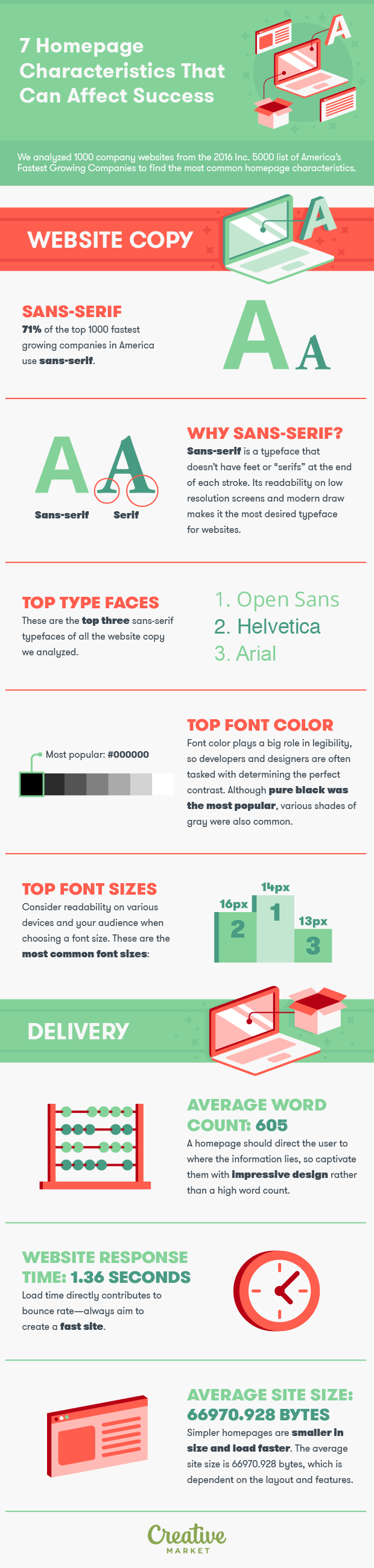
The data proves what designers already know—that legibility and ease of use should be the highest priority on your homepage even over keyword integration and the proper use of metadata.
Not only is this good practice from a user experience standpoint, it is also the correct course of action to make sure that you are adhering to accessibility standards. Visual impairment affects more users (and potential users) than you may realize. For example, 8 percent of men and .5 percent of women in America report some level of color blindness. This means that factors like high contrast and font size have a large impact on general user experience. In addition, following accessibility guidelines put forth by the Web Accessibility Initiative has been shown to improve SEO for all users. The takeaway is that keeping your homepage design as clutter free as possible and intuitive to follow is the best possible strategy for your business.