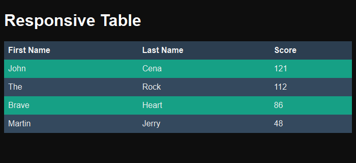
In this post I will be sharing CSS code snippet for making a simple responsive table with alternate color rows (zebra stripes). I made use of these when making leader-board tables for our HTML5 games.

CSS for Responsive Table
Please note that we are making a very simple responsive table here and this CSS code snippet may not be suitable for larger tables where all the columns can’t fit into smaller width. If this is the case then you should look elsewhere for other kind of table design which can break the data apart, or provide a scrollbar for small screen devices.
For this example, we are going to assume that you have a simple table with few columns (2-4) and want to fit the entire table in the screen width-wise. To do so, all we have to do is simply apply width: 100% to the table tag.
/* Responsive table */
table {
  width: 100%;
  border-collapse: collapse;
  background: #34495e;
  color: #f3f3f3;
}

td, th {
  padding: 8px;
  text-align: left;
}
That’s it, and now our table will fit into the width of the viewport and auto resize its columns. Note that, we are not specifying any width for our columns which will let them have a size of auto.
CSS for alternate color rows (Zebra Stripe)
Making table have alternate color rows is quite simple with the CSS nth-of-type selector. We pick up every odd row with this selector and change its background color as shown in CSS snippet below.
/* Zebra striping */
tr:nth-of-type(odd) {
  background: #16a085;
}

th {
  background: #2c3e50;
  font-weight: bold;
}
View the demo and the full code in action for the responsive table I created with alternate color rows in the codepen embed below:
See the Pen Responsive Table with Zebra stripes by Kanishk Kunal on CodePen.
As you can see, creating a responsive table is not very hard when you have small number of columns in your table. But this solution may not work for larger table and you are better off looking for other solutions such as the ones proposed on CSS tricks.

Kanishk Kunal, Thank You For Sharing This useful Information Dear, Its really Helpful.