Responsive Web Design is an approach to web design aimed at crafting sites to provide an optimal viewing experience across a wide range of devices (from desktop computer monitors to mobile phones). For doing Responsive Web Design, developers often use a HTML+CSS framework which makes responsive web design possible with pre-built media-queries and styles.
In this article, we have collected together a list of some of the best responsive web design HTML and CSS frameworks available in 2023. All the CSS frameworks listed below are open source and free.
Best CSS Frameworks for Front-end Development
It is not always easy to have a comparison between responsive web design frameworks. As one may offer certain set of features which are suitable for designing faster and leaner websites, while some other framework may offer vast set of features, plugins and add-ons, however it may be bulky and harder to learn.
We have tried to include a brief description of all these frameworks to help you make your choice easier. Don’t forget to learn the importance of responsive web design before you march onto developing your own responsive websites.
1. Bootstrap
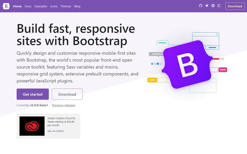
Bootstrap is the most popular HTML, CSS, and JS framework for developing responsive, mobile first projects on the web. Bootstrap makes front-end web development faster and easier. They have extensive set of documentation, examples and demos to get you started quickly with responsive web development. You will find that Bootstrap did a few major changes in Bootstrap 5, such as becoming jQuery free and adding RTL support (see full changes in Bootstrap 5 vs 4). This along with ready-made components and utility classes, makes Bootstrap one of the best framework choice for web developers.
You can also find many free and premium bootstrap templates and UI Kits that will make your web development journey easier.
2. Tailwind CSS
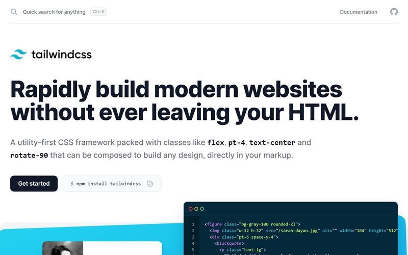
Tailwind offers a modern utility based approach for building responsive sites. It has vast amount of utility classes that can let you build modern websites without writing CSS. Be vary that using Tailwind CSS requires a development setup to trim down the final CSS size or you will end up with a large CSS file if you use the default. Nonetheless, developers prefer Tailwind’s ability to quickly add styles to HTML elements and its out of the box design styles. You can find many tailwind UI Kits here.
3. Tachyons
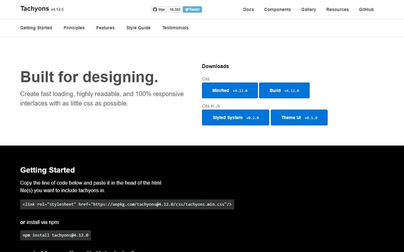
Tachyons is another utility based CSS library that does the heavy lifting of offering many styles out of the box so you don’t need to write a lot of CSS yourself. The good thing here is that out of the box style of Tachyons is lightweight and thus doesn’t require additional setup. You can still trim down the size if you want with the guidelines provided. If you are looking for a simple to use utility library then this can be a good choice.
4. Foundation
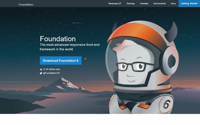
Foundation is a responsive front-end framework made by ZURB, a product design company in Campbell, CA. This framework is the result of building web products & services since 1998. Foundation is the most advanced responsive front-end framework and offers a lot of customization.
5. Material Design for Bootstrap (MDB)
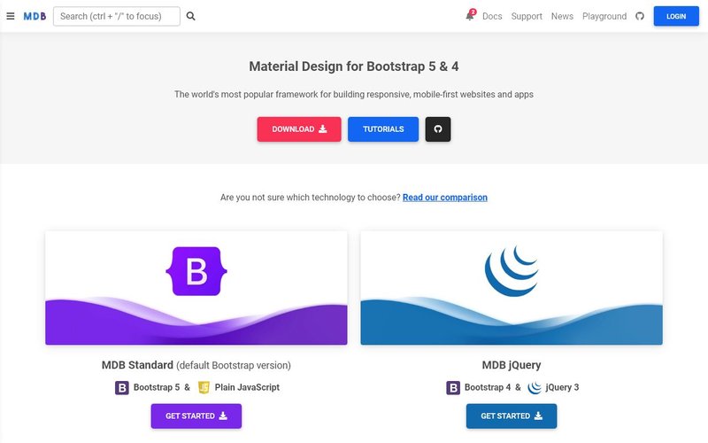
MDB is built on top of Bootstrap and provided material design look and feel out of the box. It has a great CSS library and has compatibility with most popular JavaScript frameworks such as jQuery, Angular, React and Vue.js. While the core library is completely free to use, the developers provide premium plans with pre-made templates, themes and dedicated support for business customers.
6. UIkit
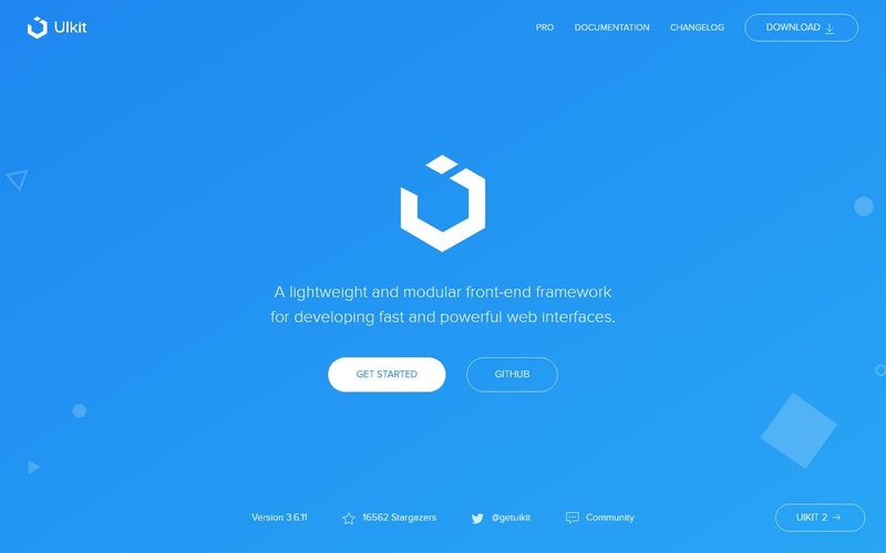
UIkit is a lightweight and modular front-end framework for developing fast and powerful web interfaces. UIkit gives you a comprehensive collection of HTML, CSS, and JS components which is simple to use, easy to customize and extendable. With the mobile-first approach UIkit provides a consistent experience from phones and tablets to desktops.
7. Materialize
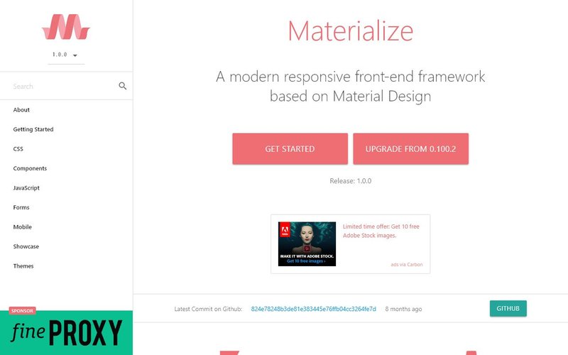
Materialize is a a modern responsive front-end framework based on Material Design. Material Design by Google is a popular design trend involving cards, shadows and animations. You can find many free material design templates on our site.
8. Bulma

Bulma is a modern CSS framework based on flexbox. It provides responsive design and mobile first UI components and has modular structure for you to import only the stuffs that you want to include in your web design. Bulma offers a flexbox based modern grid system.
9. Pure CSS
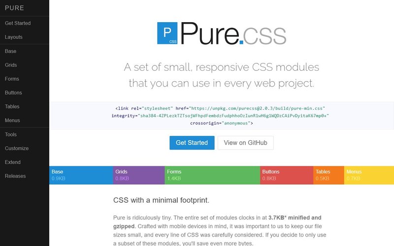
Pure.css is a set of small, responsive CSS modules that you can use in every web project. Pure is ridiculously tiny. The entire set of modules clocks in at 4.0KB minified and gzipped. Pure builds on Normalize.css and provides layout and styling for native HTML elements, plus the most common UI components. Pure is responsive out of the box, so elements look great on all screen sizes.
10. Material Design Lite Framework (MDL)
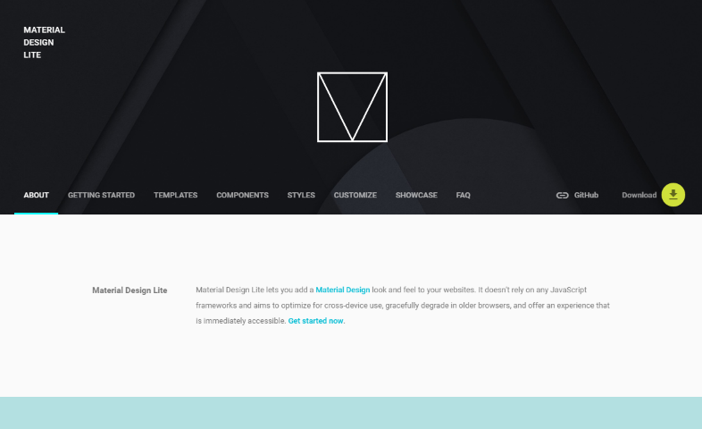
Material Design Lite Framework by Google is one of the most popular CSS framework for adding a Material Design look and feel to your websites. It doesn’t rely on any JavaScript frameworks yet it is compatible for cross-device use and does a graceful downgrade for older browsers. It is built with accessibility in mind and provides extensive set of documentation as well as starter templates.
You can find more material design CSS frameworks if you are interested in building websites with material design.
11. Semantic UI

Semantic UI is an advanced CSS framework which offers more than 50 UI elements, 300+ CSS variables for customization and is built with EM values for responsive design. It is also flexbox ready.
Semantic is a production ready CSS framework and is partnered with frameworks such as React, Angular, Meteor, and Ember, which means you can integrate it with any of these frameworks to organize your UI layer alongside your application logic.
12. Skeleton

You can use Skeleton if you’re embarking on a smaller project or just don’t feel like you need all the utility of larger frameworks. Skeleton only styles a handful of standard HTML elements and includes a grid, but that’s often more than enough to get started.
The grid in Skeleton is a 12-column fluid grid with a max width of 960px, that shrinks with the browser/device at smaller sizes. The max width can be changed with one line of CSS and all columns will resize accordingly. The syntax is simple and it makes coding responsive much easier.
13. Milligram

Milligram is a minimalist CSS framework with no dependency on JavaScript. It provides a minimal setup of styles for a fast and clean starting point of a responsive website. It offers a flexbox based grid system.
14. Spectre.css
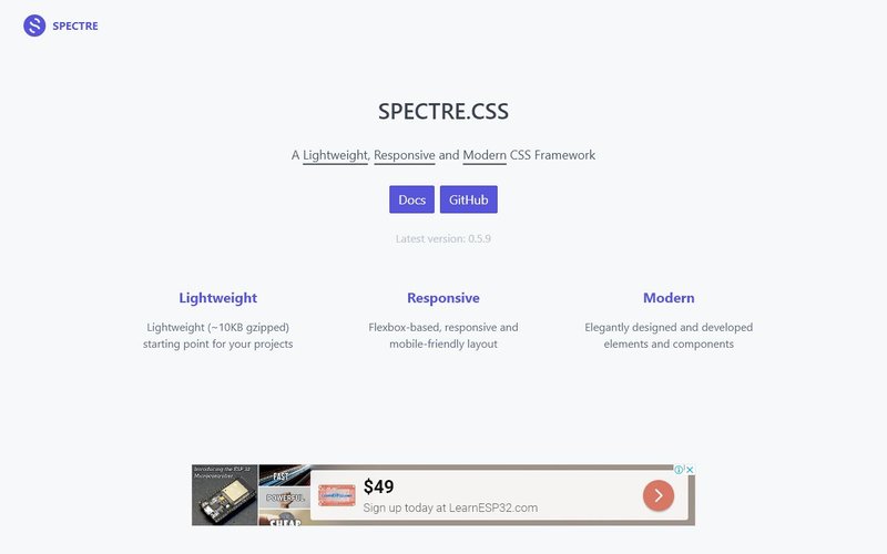
Spectre.css is a lightweight library which can be used a starting point in your web design project. Out of the box it provides flexbox based responsive and mobile-friendly layout. You can build upon it to add your styles and responsive utilities as per your website needs.
15. Base CSS Framework
Base is another lightweight and minimal responsive CSS framework that can be used to build responsive websites. It offers a free base starter along with many paid ready made templates for web design projects.
When you compare the popularity of these frameworks, you will find that Bootstrap, Tailwind and Foundation are miles ahead of others. The community around a responsive design framework is also important when it comes to getting your questions answered in Stack Overflow and other forums.
Design agencies generally choose Bootstrap as it provides out of the box components and is also easy to customize. Which is why you will find many Bootstrap themes and libraries available such as Bootstrap admin templates, Bootstrap UI Kits and more.
Which responsive framework is your choice for web development? Do you develop responsive websites? Take a look at some of these material design website templates for inspiration.
Thanks for the list. Bootstrap is still my favourite, it’s easy to use, simple, fairly lightweight and stable.
true
Thanks for the list. Have you tried mini.css? I think it’s a pretty decent alternative to some of these : https://chalarangelo.github.io/mini.css/
Surprised you put Bulma so far down the list. It’s one the simplest to use vs. many of the others chosen above it. Much simpler and more flexible than Bootstrap IMO. Tailwind – ugh. If you like div’s with 10 classes go for it. Not knocking your list, just maybe would wonder your reasoning for the ranking system.
Thanks for chiming in Steve. It is mentioned right at the top that it is not always easy to do the comparison (or ranking) of CSS frameworks as each one of them offers something different from the other. One developers likes something in one and hates something in other, much like your preference about Tailwind and Bulma. Hope that this makes you feel better: There is no ranking, it is just a list. It was never mentioned that they are ranked.