Let’s start this post with a simple question: are onboarding emails performing enough or not? According to the various researches and stats, in general, this practice fulfills its mission. The efficiency of onboarding emails is about 40 – 60%. It sounds not bad. But on the other hand, the same researchers prove that another 50% (+/- 10%) of users are being lost very soon after they came. Just a couple of visits, purchases… And they go away.
There are many reasons to leave, surely, but the most typical is the lack of product value understanding. And this is what we really can change. 50% is a good rate but not perfect. There is another half to grow. So how to increase conversion and reduce churn rate?
For this purpose, let’s take a look at strategies and tactics of attractive, helpful and powerful onboarding via email marketing.
What is onboarding?
In a nutshell, onboarding is about the client’s adaptation. Or even addiction :) This process is aimed to engage newcomers to your brand, products, and services. This strategy consists of instruments such as popups, video manuals, and interactive user guides. There are many practices as well as ways to apply them. Everything starts with a sign-up form at the stage of new client registration. Yes, this is the first onboarding item to“tame” new users.
Onboarding emails
But when newcomers signed up to your newsletters, it’s time to proceed with onboarding emails. These messages help clients to get used to your brand. Onboarding emails are confused with welcome emails sometimes, though they are not the same. More precisely, welcome bulk mailings and series are parts of this onboarding process. There could be also recommendatory emails etc. There are many good examples on how html template for email should look like. You choice depends only on your taste and the client’s actions.
Why is the email channel of great use here? Because the registration process usually requires to share the newcomer’s email address. Then, a newly registered client expecting to see a welcome message in his or her inbox.
Moreover, newsletters campaigns are an efficient tool to remind about our brand, products/services, and their value. In this way, attraction and addiction are getting stronger.
Of course, it works only when the onboarding strategy is planned well. We want to share our experience on how to boost customer engagement and minimize churn rate. First of all, which types of emails are essential to awake interest?
Onboarding email types
They are many. You can even invent and test in action your own types :) But the most common types are here:
1. Welcome emails for newcomers
This message is what everyone is waiting for, so send it immediately after registration and greet the newcomer.
What is essential for these emails? The key condition is one transparent message per email. That’s why we strongly recommend arranging a welcoming series instead of single emails. Try a sequence of emails with this set of goals:
- fill out the new user’s profile;
- download software or mobile app;
- try service or product first time.
The etiquette matters a lot here. So always send emails from your company’s domain and add your address to reply or ask questions if the client needs it. These simple rules form your image of a trustworthy, user-friendly brand.
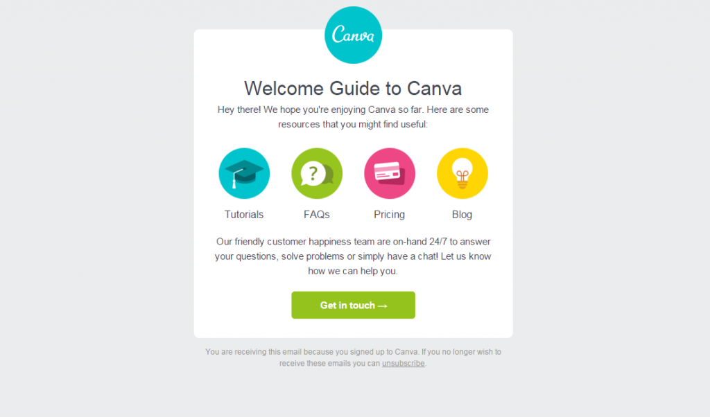
Just like Canva did in their welcome series. Worth to notice their well-done CTA and the whole color scheme.
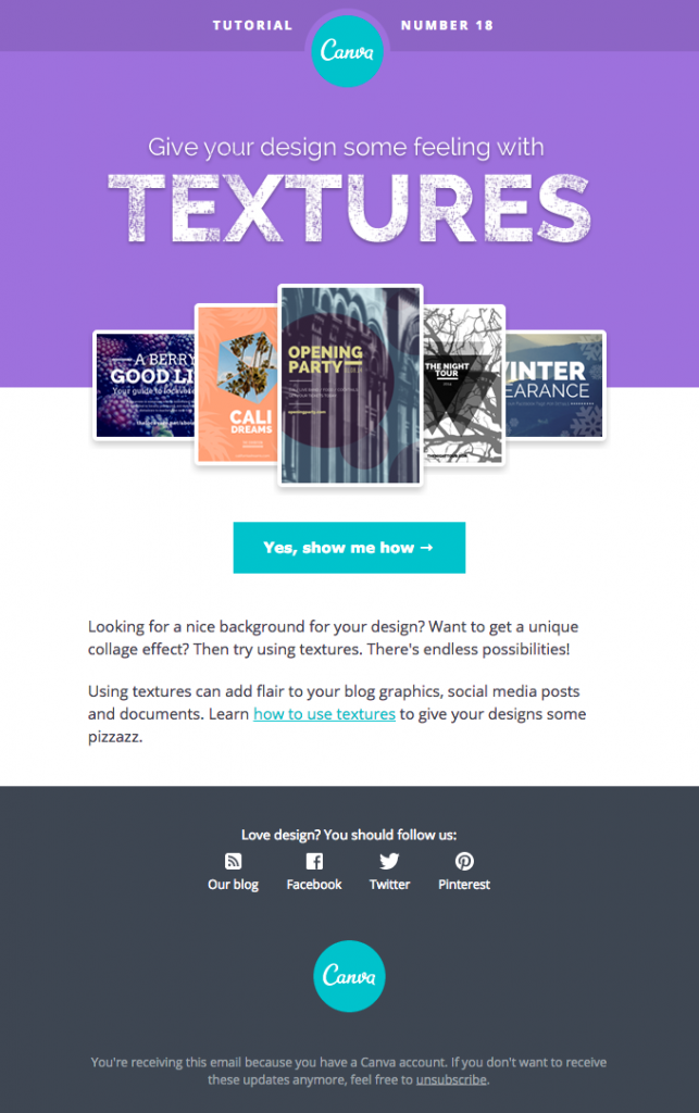
As well as another tutorial from the same brand.
The screenshot below is taken from the Uber welcome email. Right after a new visitor got registered, Uber is mentioning the mobile app and provides you with a link arranged as CTA and empowered with the pic. It’s hard to skip.
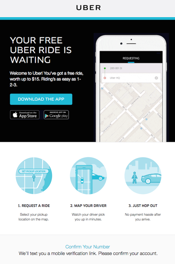
Remember that all onboarding emails should contain just one CTA button, not two or more.
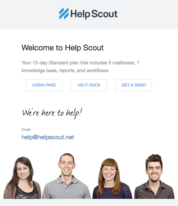
Help Scout apply another practice to attract attention. The company sends personal emails. How do they reach this effect? With photos of their team. Simple but looks much more personal.
2. Introduction of product or service
Emails of this type explain how to use what you offer. They are usually sent right after the aforementioned welcome emails or series. Their mission is to show, educate, and remind.
Again, don’t overload these emails. They work better when arranged as a series too. Share your information in several stages. The rule is similar: one manual of advice per email. Announce what clients will get, for instance, “You will receive 4 video tutorials for 4 weeks”.
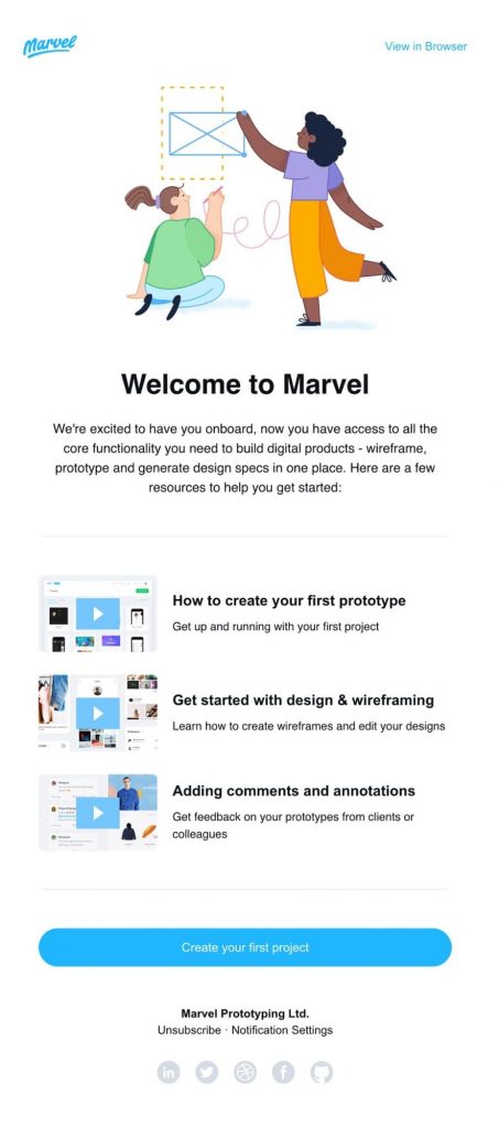
Or like in this email: three stages in one email but so clear and intuitive.
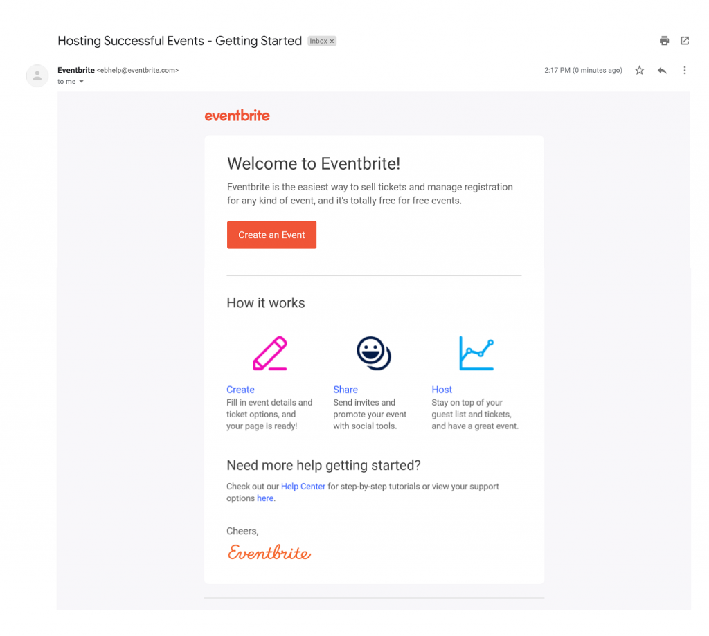
3. Sharing experience of users
When we choose something, what is often has an influence on our decision? Right, we pay attention to feedbacks and customer rates. We think we’re not the only one who is looking for reviews. This is when former and actual users become stars. If you see reviews that make you proud, add them to your campaign.
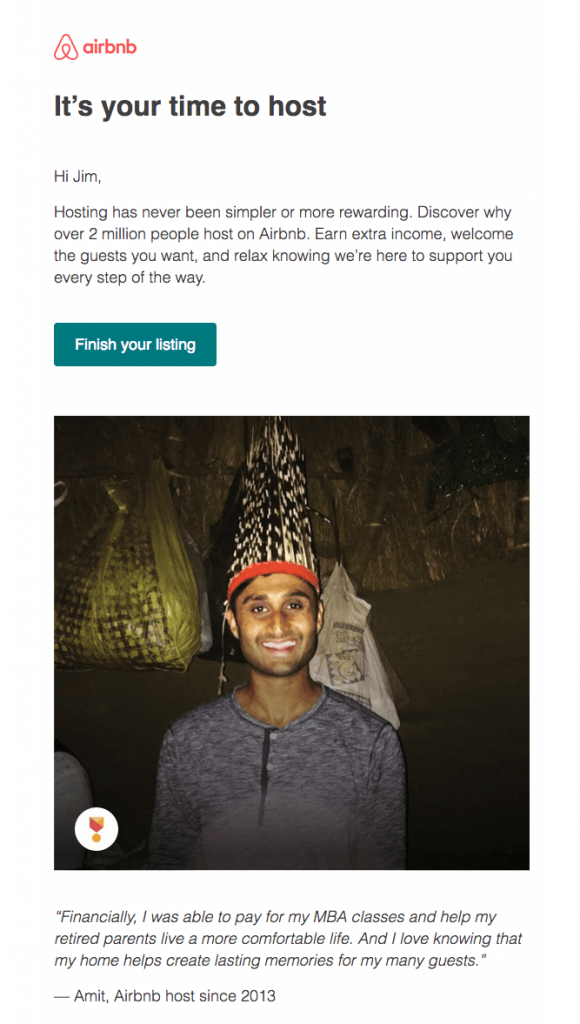
Airbnb uses reviews of clients that use their services since 2013.
And it seems to make a positive impression.
4. Optimizing newcomers experience with products and services
Analyze your inboxes and think about the most typical questions asked there. This way you can arrange FAQ to prevent people from disappointing troubles. It may be either a single FAQ email or a series.
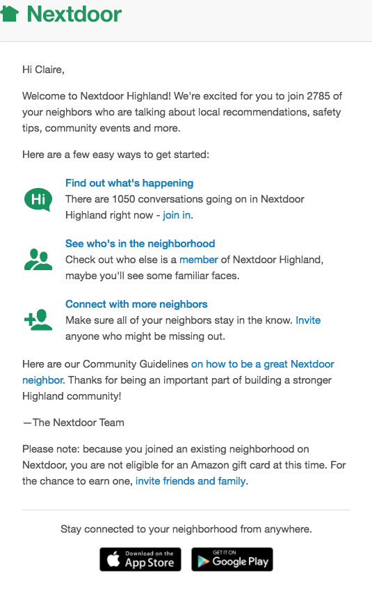
What we liked about this email: design style, CTAs, and App Store/Google Play buttons.
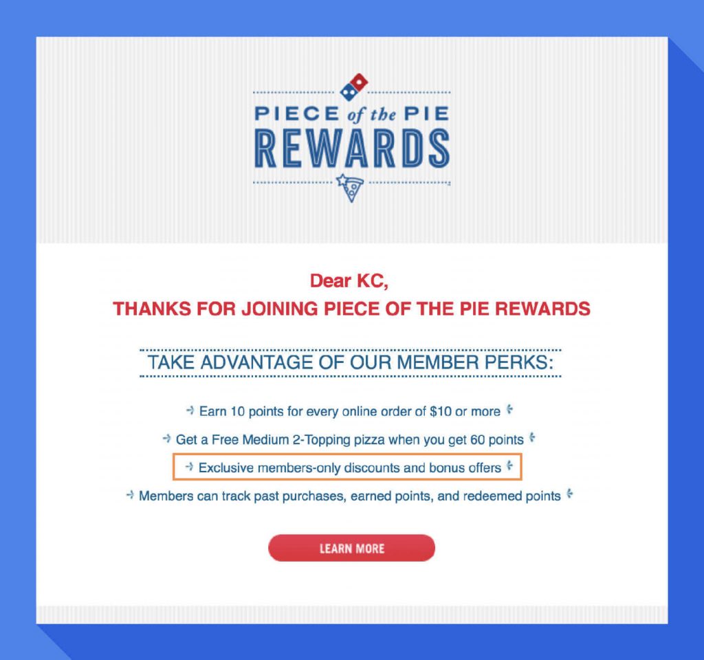
5. Emails with bonuses
Users make purchases more often when some pleasant bonus is offered for free. It may be a discount, coupon, trial period, etc.
6. Sharing user’s personal progress
By the way, this practice belongs to hyper-personalization which became one of the top trends this year. So don’t skip this solution – it brings conversion!
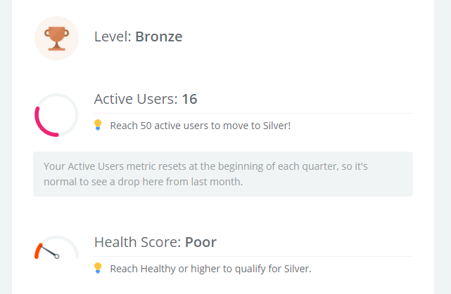
Such emails are based on personal activity data and should be maximally personalized. Show clients their personal progress and mistakes, share statistics, say who has achieved and which further achievements are waiting for him or her.
Zapier, for instance, arranges personal users Metrics:
Share advises and tips on how to make results even better – and motivate with rewards for what is already achieved. You can also present some advanced options that users didn’t try yet.
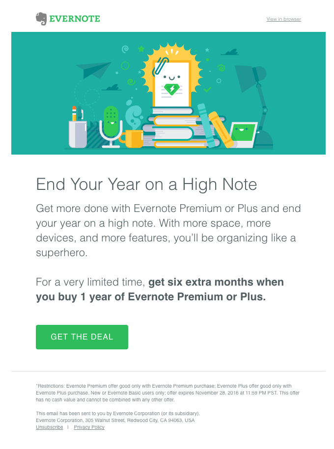
7. Offer to buy
You’ve already shown the advantages, offered bonuses… Now it’s time to offer. A performing trick here is to show the whole price and make a discount, it always works:
What to do when rates refuse to grow?
It may sound a bit harsh but honest: no one may reach 100% performance here. Even with brilliant ideas and god-level implementation of top practices, some new clients are lost anyway. Well, don’t give up even In this case. You can reengage them with a special sequence.
Who are the lost clients?
For example, they are those who started to use a trial version but didn’t buy a paid tariff plan. Emails are of great use here to prevent churn rate.
How does such a sequence look like?
In the first email, remind that client’s trial will expire soon – and offer to pay for subscription.
The next email informs that access is about to be canceled.
In the last email, offer to think again and re-join.
Final thoughts
We’d like to end up this post with some more practical tips that may be useful for you and your onboarding email marketing.
- Tell and even boast that you’re a problem solver. Say and show how you help to save time and money, design websites, transfer videos online, increase incomes, etc.
- Appeal to good and positive emotions – make your content easy to understand, interesting and catchy.
- Segment database and personalize emails. Analyze the people’s needs and send them relevant, precisely targeted campaigns.
- Motivate clients to act: offer them discounts, gifts, bonuses for inviting friends, etc.
- Stay updated. Things are changing constantly including the client’s life and your products. Thus, you need to review and upgrade your campaigns, and then analyze the results of these tests.
Related Read: 7 Best Email Marketing Services
We hope our tips and examples will be inspiring for you to design emails. Just remember that there’s no universal magic key to success door. So test, experiment and invent to make your campaigns really performing.
Good luck!
