Having a responsive web design is crucial for your business.
Manually developing numerous versions of your website to work on every device known to the modern man is impractical and crazy expensive.
After all, it would take tons of time, energy, and resources to maintain all versions of your site.
The solution? A responsive web design.
When you design a responsive website, your site will adapt to various screen displays. This improves the user experience and allows you to gain many other benefits, including increasing your site traffic and conversions.
If you’re ready to know more about what responsive web design is and why it’s crucial, then read on to find out.
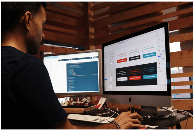
Understanding responsive web design
From a 30,000 feet view, responsive web design is a way of developing and designing a website, so it automatically scales its elements and contents to match a viewer’s screen display size.
Responsive design keeps your web images from becoming bigger than the viewing device’s screen width and prevents mobile users from doing extra work to read your content properly.
Essentially, the goal of adopting responsive web design is to optimize your site for multiple devices so users won’t need to resize, zoom, pan, or scroll through your site unnecessarily.
Websites that are not designed to be responsive are often hard for your visitors to navigate and use on various devices. This can cost you potential customers, and in turn, conversions and sales.
Additionally, having a responsive website means you won’t need to design a dedicated mobile-ready website for smart device users.
Generally, the three main components of a responsive website include:
● Responsive images. A responsive image shrinks and grows with the browser your website visitors use to fit the web pages.
● Media queries. Setting proper media queries allows you to include device-specific rules for showing or moving web content, making the user experience when browsing the site better for each device.
● Fluid layouts. A web page designed with a fluid layout allows the page to resize as the window screen size contracts or expands.
Leverage reliable responsive web design tools along with best practices. Doing so allows you to design websites that adapt to multiple screen sizes, allowing you to build a responsive site that automatically scales to match your viewers’ device screens.
Why you need a responsive web design
Besides providing various display adaptability, a responsive web design offers several other benefits.
Better user experience
An effective website provides users information and allows them to accomplish what they need quickly and easily, regardless of the device they’re using.
Design your website to be responsive so mobile, and other smart device users can navigate your web pages with ease.
Doing so can boost your audience engagement and increase your conversions and sales opportunities.
With a responsive website that scales effectively to mobile and other smart devices, users can easily access all the buttons and menus.
The chances of your visitors staying longer on your site increases, giving you more opportunities to convert them into paying customers.
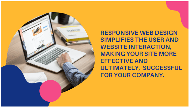
A responsive web design simplifies the visitor or customer and website interaction, making it convenient, effective, and ultimately, more successful for your company.
Flexibility when applying changes
A website with a responsive design is generally easier and quicker to update or change since you’re only handling one site.
This flexibility to implement and adopt website changes is a massive advantage, allowing you to make quick design tweaks or fixing a typo or two because you’ll only need to do it once.
Implementing responsive web design also makes managing your website more efficient since you’ll only need to update content once, regardless of how various users consume your content.
Responsive web design can also help lower your web management expenses and increase your returns since you can make small changes to your one website in a jiffy.
You won’t need to hire a web designer (if you don’t have one in-house) to implement a few tweaks and updates.
A responsive web design can help take away a lot of the effort and stress associated with managing your website.
Good for SEO
While Google has not outrightly said that responsiveness is a ranking factor, its algorithm leans toward ranking mobile-responsive websites higher on the search engine results page (SERP).
This is because a mobile-responsive website provides a better user experience, which is crucial to Search Engine Optimization (SEO) and ranking higher in SERPs.
Google also prefers a single responsive website than two separate versions of the site (regular and mobile) since one responsive site with one URL is easier to crawl.
The easier it is for Google to crawl your website, the higher your site’s chances of ranking higher in SERPs.
If you have two versions of your website with essentially the same information, Google can view this as plagiarism, leading to your site ranking lower. This can lower your website’s visibility and traffic generation opportunities.
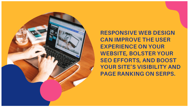
Responsive web design can improve your website user’s experience, bolster your SEO efforts, and boost your site’s visibility and page ranking on SERPs.
Boost website traffic
Statistics show that 55.56% of traffic worldwide comes from mobile phones, making it crucial to adopt responsive web design.
If your website isn’t responsive, you could be missing out on a huge amount of traffic and potential customers.
Responsive web design increases your website’s reach and opportunities to reach bigger audiences, helping you boost your online traffic, audience engagement, and sales.
Essentially, responsive web design allows mobile and other smart device users to use and access your site effectively, whether they are browsing, researching, or buying.
Increase conversions
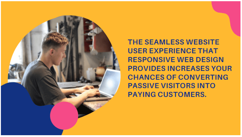
The easier it is to access your website on any device, the better the user experience. This seamless site interaction increases your chances of converting passive visitors into paying customers.
Responsive web design can also encourage your visitors to stay on your website, giving you opportunities to show prospects your offer, unique value proposition, and benefits.
This helps you build trust with your website visitors leading to better conversion rates and higher sales.
In a nutshell, responsive web design makes it easy for website visitors to access, interact with, and use your website, contributing to an overall positive site experience.
What’s next?
Your beautiful web designs can mean diddly squat if your website isn’t optimized to be responsive on multiple devices, making responsive design a critical part of your web design strategies.
With all the available software, platforms, and tools online, building and even shifting to responsive web design is at the tip of your fingers.
Don’t miss out on the game-changing benefits of responsive website design and start building or adopting your site now.