Clean design is much more than a popular trend, it’s something that will elevate your name and catch your customer’s eye because of its simplicity and elegance. The following branding tips will show you how to get a minimal and elegant design.
Why does minimal and uncluttered design look so tasteful? Because when done right, it is meaningful and simple. The person looking at a minimal design focuses on the essential and there are no elements that distract from the message you’re trying to deliver.
Work with Pastels, Neutrals, and High Contrast
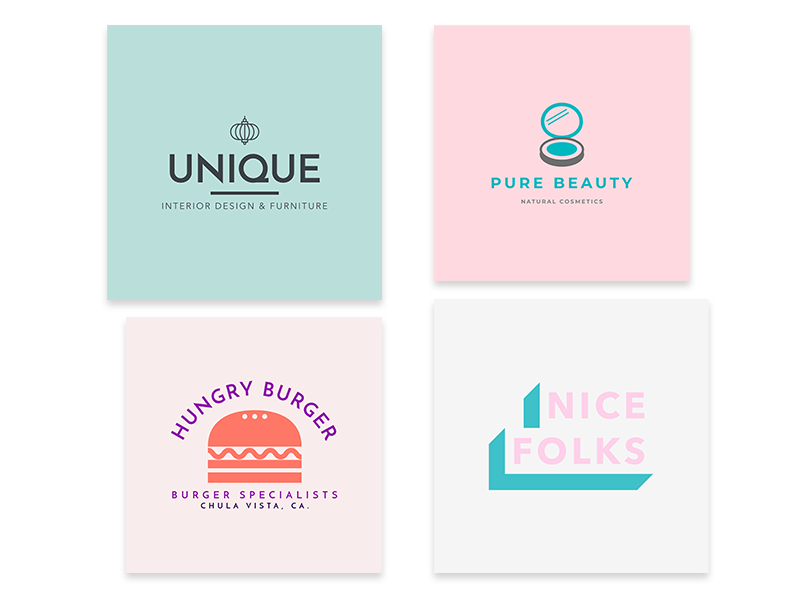
Let’s start with the basic stuff to create branding materials. Try something neutral with your color palette, so your brand feels approachable. If you don’t know how to create a minimal color palette, you can follow these simple yet effective steps to get the look you need:
- Choose up to four colors.
- Make sure two of them are complementary.
- For the other two, pick colors that contrast with each other.
- Go for desaturated hues that either lean towards black or white.
Here are a few examples of color combinations you could use for your brand:
Show Honesty
Dishonesty has been seriously out for a while. According to recent studies, 94% of consumers consider transparency really important to make their purchase decisions, and for millennials, which represent 30% of consumers, honesty is the most important value for brands.
Pretentious and over-the-top logos are not attractive for that target. So, in order to get a good logo design, it must be super simple and to the point. If you have zero clue on how to design a logo, use a logo generator to get the best results and send a message of honesty about your brand.
When creating a visually appealing logo online, you should choose a template with simple lines, abstract drawings, geometric shapes, and a good text-image ratio. If you’re going for a text-only logo, it’s fine too.
Play with Negative Space
First of all, what’s negative space? The area that’s not color or text in a logo.
It may seem like the white space between elements, but it’s key to make a design visually appealing. In web design, this is crucial because it allows the user to focus on relevant information and calls to action (CTAs).
When creating your visual assets, play with how shapes interact with each other, see how they look aligned or if you can create a larger shape by trying different scales among the elements.
Also, balance plays an important role when displaying images and text. Everything must be there for a reason; if you’re just adding pictures, text, or graphic elements, the attention will be all over the place.
Use a Sans Serif, Simple Font
A sans serif font is easier to read and suits a minimal design. Minimalism means to know how much is just enough, so simple lines will give your brand that modern, clean look.
Legibility must be favored when it comes to clean design. Look for fine fonts like Quinta for an approachable look, or Vivant if you want a more vintage, glamorous font.
In case you want to take a shortcut to choose a good, clean, effective font that matches your minimal style, there’s always the Helvetica family or Arial if you don’t want to expand your search. Greycliff, on the other hand, has smooth lowercases and strong capitals.
Either way, test some fonts before choosing and make sure they read and print well on different materials.
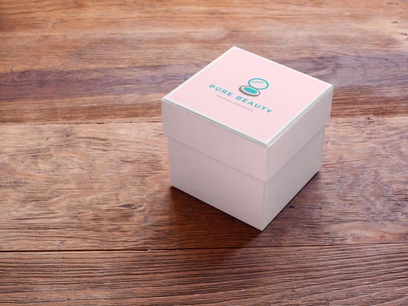
Display Your Product Elegantly
Even if they’re for social media, use professional photos to show your product. Use minimal design to make your brand look polished, especially when working on the packaging. You should aim to get a perfectly-executed product.
Additionally, when you’re getting your product shots, choose natural or white light instead of neon or colors. This mini-guide will help you get the perfect photos:
- Pictures should be clear and descriptive.
- Use product-only images on a regular basis for social media.
- When introducing a product, go for an image without a background. You can use a mockup to do so.
- Don’t overdo it. Props are only useful when you need to explain ingredients or pieces that complement it.
- Keep the focus on the product, meaning the background should be the least important part of the composition.
Remember that using less also means using it better. Minimal design isn’t just about subtracting things from your brand’s identity but to make it work and keep it meaningful.
Now that you know the basics, what do you think about clean design? Is it something that could work for your brand or are you into mixing colors, fonts, and textures?
Share your insights on what has worked best for your brand!