A logo represents everything a brand stands for. More often than not, people identify a company by its logo more than the brand’s name. It is therefore important to have a professionally designed logo to get off with establishing the brand identity. A logo that can be used in products, like app or game splash screens, websites and also in business cards that are handed out to potential clients.
But what makes a logo perfect? What are the design fundamentals that go into the making of a powerful logo? To help you understand these and the process behind logo design, we have brought for you some great infographics. These infographics may not present rigid rules, and you may need to break the mould; nevertheless having a set of guidelines is always handy to get started with and save time.
1. The Recipe for a Perfect Logo
This comprehensive infographic by Company Folders illustrates the qualities that a successful logo must have. Each trait of a good logo like uniqueness, timelessness, simplicity, adaptability to fit multiple size screens and consistency has been explained with examples of logos of famous brands.
When designing a successful logo, you need to pick the right logo font, color and shape to reinforce your brand personality.
Source: Company Folders
2. The 10 Commandments of Logo Design
Is your logo too complex? Does your logo look good on small as well as large screens? DesignMantic brings the elementary principles of logo design as 10 Commandments of Logo Design in their infographic.
Source: DesignMantic
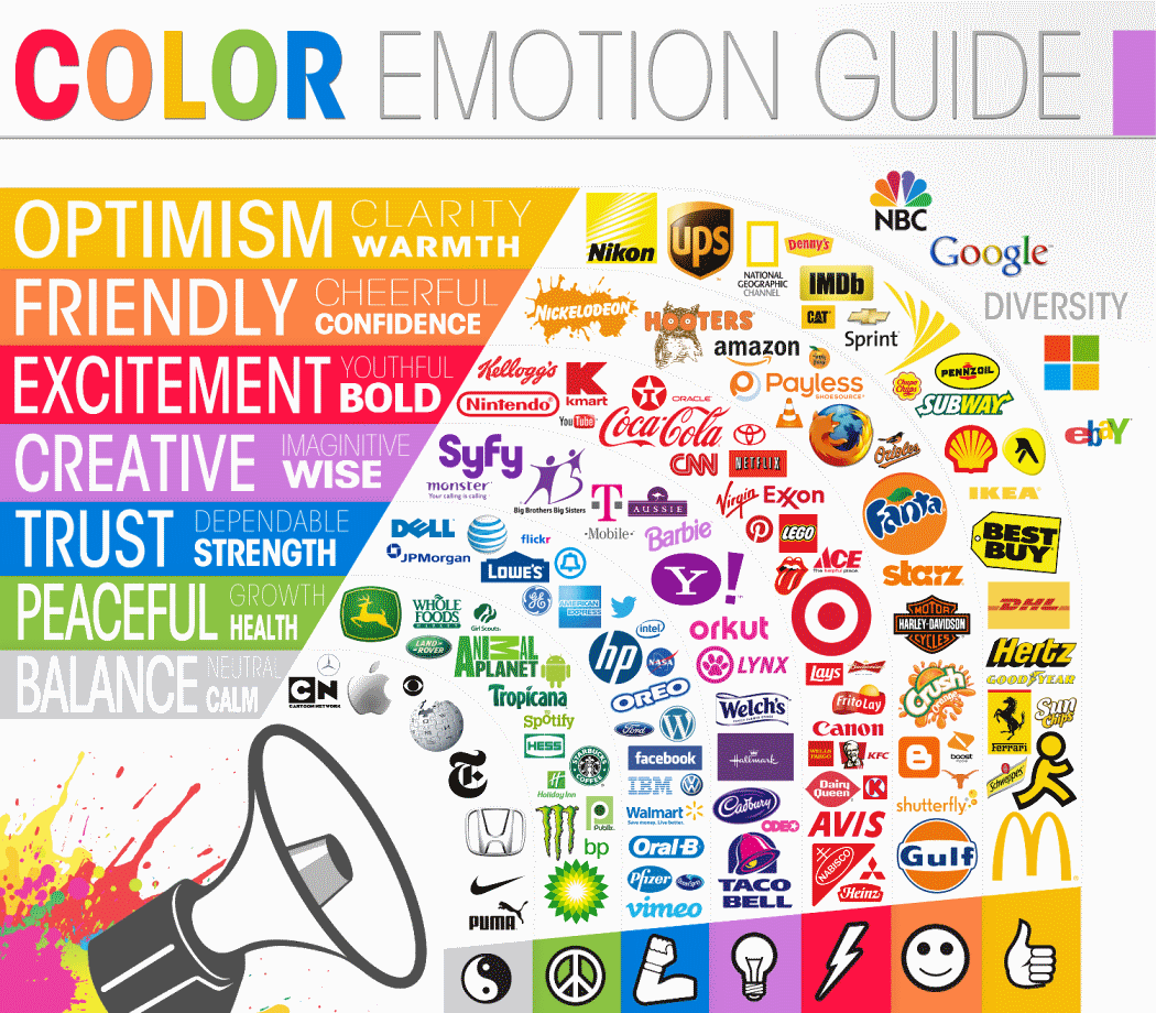
3. Color Emotion Guide
Color plays an important role in logo design. Each color evokes different emotions, like yellow is optimistic while purple sparks imagination. This infographic, courtesy The Logo Company, shows what specific colors say and how famous brands have used them to their advantage.
Source: The Logo Company
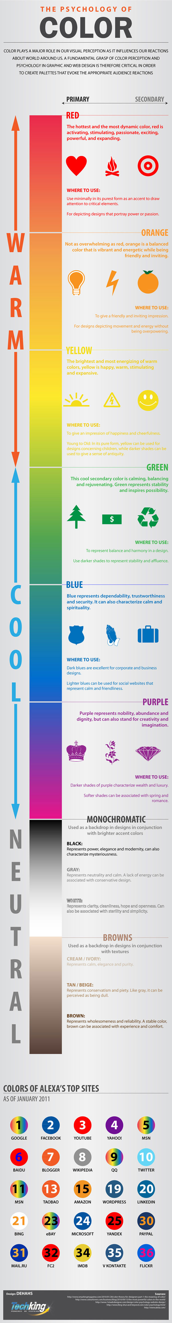
4. The Psychology of Color
Similar to color emotion guide, this infographic by Tech King shows how different primary and secondary colors affect visual perception and the scenarios where a particular color fits in.
Source: Tech King
5. Recipe for Retro Logo Design
This infographic explains the components that go into designing a great retro logo – from simple shapes like circles and badges, to limited color palettes, textures, and complementary retro style fonts. Though it focuses on logo design, these broad principles apply across most design areas. With retro and vintage style trending in web design today, this infographic can be a great reference source when creating a retro look for your own project or client work.
Our set of free retro web icons and retro actions for Photoshop will be an asset if you are planning to adopt retro style in your own design projects.
Source: 99designs
6. The Incredible Way Your Brain ‘Sees’ a Logo
To end with, we have an infographic from Entrepreneur that details the science behind how our brain perceives a logo design. Well liked brands and their logos trigger responses in the same areas of the brain that process human relationships! Now you know how a good logo can build loyalty between companies and customers.
Source: Entrepreneur
As seen in these infographics, choice of color, shapes and fonts play a key role in logo design. That is why you need to understand the psychology behind these elements to convey right emotions in a logo. You can read this informative post by CreativeBloq to know more on psychology of logo shapes.
Sometimes, a need may arise to revisit logo for your own startup and redesign it to keep dated, or maybe you are working on a logo makeover project for a client. You can read our post on logo redesigning tips that has an infographic with takeaways from some of the successful logo redesigns over past few years and the pitfalls to avoid.
Also note that you can create good logo even in MS Word. Find more information about how to create great logo in Word here.
Are you a Graphic Designer with experience in logo design? We would love to hear what you would like to suggest to our readers who are looking to design the prefect logo.
Great!!