Having a website is no longer an option; rather, it’s a must for a business that wants to be successful long-term. A website builds trust, helps customers find information about your company, enables you to stay in touch with customers and helps you spread awareness of your firm and what you offer.

What Makes a Good Website?
Even so, a business website on its own isn’t enough to generate traffic and drive sales. A good site has to have the right pages, an appealing, appropriate design, and user-friendly features in order to showcase your business in the best possible light. An improperly designed site can actually hurt your business more than having no site at all. In fact, recent statistics show that it takes new site visitors only 50 milliseconds (.005 seconds) for them to form an opinion about your site. What’s more, a whopping 88% of site visitors won’t come back to your site if they have had a bad experience on it beforehand.
Every business is unique, which means your site will need to look, feel, and operate differently than other sites in your niche. Even so, there are some features that every single website should have. First, successful websites generate trust by using uniform branding, an appealing logo, high-quality images, and by displaying the company’s contact information in a prominent location. Such sites are also optimized for mobile devices to ensure that visitors can see site information clearly from any device. Nearly 80% of consumers say they won’t interact with a site that won’t display clearly on their device and the device of choice is fast becoming a mobile phone rather than a desktop or laptop computer.
Furthermore, successful websites have a clear call to action, so site visitors know what the business does or has to offer. Site managers use conversion rate optimization strategies to assess site traffic to determine the site’s ROI. If a particular page is successfully generating sales, site managers can immediately see which keywords are bringing in customers and use these on other website pages and/or in online advertising campaigns. Conversely, web pages that perform poorly can be redesigned or even eliminated as needed.
Some pages on your site will likely need more attention than others if you want to be successful long-term. Following is an overview of how to design the three most important pages on your site, along with examples of companies that have outstanding pages that successfully generate traffic and sales.
Home Page
The home page is one of the most visited pages on a site. As such, it is a virtual store window and therefore needs an attractive, compelling display that will make people want to find out more about your business.
A homepage should have clear, high-quality images. It should feature your company name and logo, and explain what your company has to offer in a nutshell. It should include links to other pages on your site, so interested visitors can find out more about any topic that catches their interest. There should also be a clear call to action to make it easy for visitors to know what to do once they’ve decided they want to do business with you.
Your homepage also needs a compelling value proposition. It should not only explain what you offer but also make potential customers want to do business with you. Take some time to think about the target demographic you want to reach and make sure your homepage attracts people who are most likely to convert into paying customers.
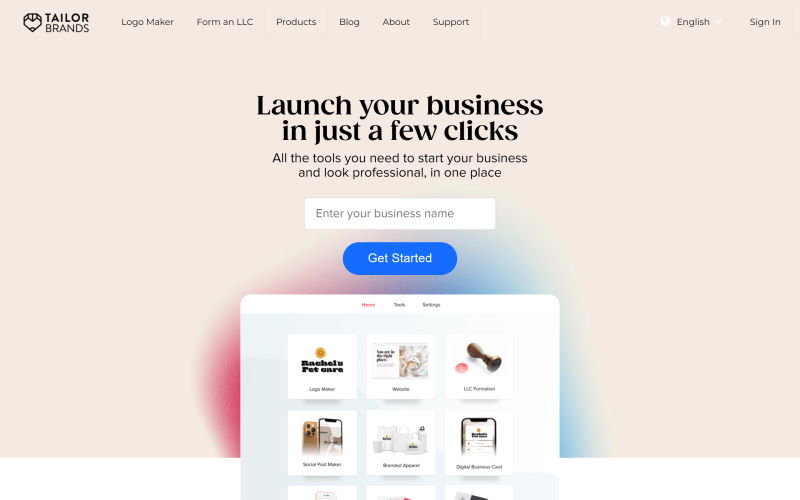
Business branding website Tailor Brands has done a superb job on its own homepage. Each service is described in a few sentences, and bold headings separate each section to allow for easy skimming. A handy menu at the top makes it easy to find more information about the site, and a slideshow featuring positive customer reviews assures new customers that Tailor Brands has a track record of offering great service at a great price.

About Page
What sets your business apart from the competition? Are you a family-run firm that has been operating in your local area for decades? Are you a cutting-edge firm using the latest technology in your field? Are your products/services more eco-friendly than those offered by your competitors?
Every company has a backstory. What’s more, every company should have a mission statement and core values. Consumers crave authenticity; they want to know more about you before doing business with you. Allowing people to get to know you will also cultivate brand loyalty, encouraging customers to keep coming back to you even if competitors offer similar products/services at the same or even a lower price.
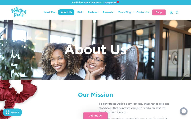
Healthy Roots Dolls has an amazing About Us page that business owners would do well to learn from. It explains the business owner’s passion for her field, the reason she started the company, and how the company helps make life better for its clients. Furthermore, those who want to find out more can click on an embedded video of the founder’s TEDx Talk. There is a handy menu for customers who want to find more information on a particular topic or make a purchase, along with a 15% discount to entice new customers to give the company’s products a try.
Related: How to Design a Great About Us Page

Products/Services Page
Products are tangible items that can be purchased without much interaction with the company. Services, on the other hand, aren’t tangible, and will likely require consumers to interact with your company’s representatives either virtually or in person. The design for these pages will vary. On a products page, you want to showcase items using high-quality photos; with services, you want to explain what you do and showcase your employees’ expertise. Before and after photos should be displayed if you have them, as they help consumers see your high-quality workmanship at a glance.
If you offer both products and services, and your products are directly connected to your services, you may need to display them all on a single page. This is particularly true if you sell products that are meant to be installed by a professional. Alternatively, you may opt to have two pages that link to each other, so site visitors can easily see what you do and don’t offer.
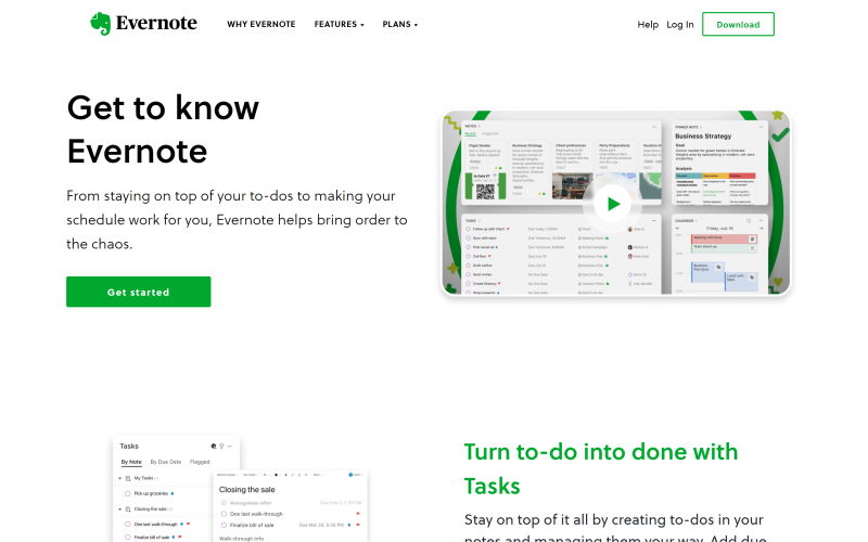
Evernote’s Feature page does a good job of providing fast, enticing insight into all the company has to offer. Each feature is described in a single sentence; what’s more, the description grabs attention by telling site visitors how the company’s offerings can improve their life and work. A “find out more” link is included at the end of each description so site visitors who want to learn more about a particular feature can find the information they’re looking for without having to look through the main menu to find the right page. In between feature descriptions, there is a slideshow featuring positive reviews from leading news outlets. There is also a link to the Evernote plan page, so users can see what each plan includes and how much it costs.

A winning website is an invaluable asset that will serve your business well for many years. It will help you stand out from the competition, generate awareness of who you are and what you do, bring in a steady stream of new customers, and inspire brand loyalty that will keep customers coming back to your business. It will likely take time and research to create such a site for your new business, and you will most likely need to adapt your website as time goes by to ensure that it is in step with the times and remains relevant to your target audience. Even so, you can rest assured that your research and hard work will be worth it and help your business grow faster than it would have otherwise.
Cover Photo by Visual Design on Unsplash
