Graphic design color palettes are an integral part of the designing process. Using the right palettes for each theme is essential for visually appealing design. For beginners, it is vital to understand what color palettes are and know which graphic design color palettes are trending to create an impressive design.
Colors describe the ideology of design. The colors allow designers to bring their concepts to life.
A design can be a hit or fail depending on the best combination of all the elements, including color palettes, fonts, and images. Choosing the color palettes for each product, business, or occasion can test even the most experienced designers.
If you are new to graphic design, we have created the best guide for color palettes.
This article will discuss everything you need to know about using the right color palettes for designing in 2023.
Here is what you will learn in this guide:
- What are graphic design color palettes
- Trending color palettes on festive occasions
- Meaning and importance of color palettes for festive dates
- Trending color palettes for 2023
For beginners, this guide can be particularly helpful. However, if you are an experienced designer, you can also learn which color palettes are trending in 2023 and how to use them in your designs.
What Are Color Palettes?
So, what are color palettes? Why are they considered important in graphic design?
A graphic design color palette means the full range of colors used in a design or a theme. It’s the combination of colors used by a designer in a certain project and must fit the core concept or ideology of the design.
Using the right colors in your designs can make them visually attractive and leave a lasting impression. For instance, a UI designer would pick a few colors that best describe the product or service and use only these colors in all the interfaces they design for a specific app or site. This color palette should be distinct from the basic concept behind the design, rather it should complement the theme.
The color palettes for graphic designers have also changed over time as computer technology has evolved.
Trending Colors In Festive Dates And Their Meanings
Graphic design color palettes not only change with the new design trends but also vary with the different festive events. Different events call for different types of flyers, greeting cards, and social media posts.
For instance, if you are making a graphic design to celebrate New Year’s Day, you would use a color palette comprising colors such as grey, silver, red, blue, and yellow. These colors show the festive spirit of New Year’s and are associated with the hopefulness and excitement of new beginnings, a bright sun to mark the first morning of a new year, and fireworks.
Once you have understood what color palettes are, let’s look at how you can find the meaning behind colors and use them for festive posts and celebrations.
Carnival Colors
Carnivals are fun and remind one of family, games, candies, confetti, and swings. Such events are bright, colorful, and loud. Carnivals can include masks, balloons, and parades. These events are usually rooted deeply in traditions and have some historical significance.
Keeping with this theme, designs related to carnivals requires a cheerful and exciting color palette. Carnival colors and images are vibrant and invoke a sense of mystery and excitement.
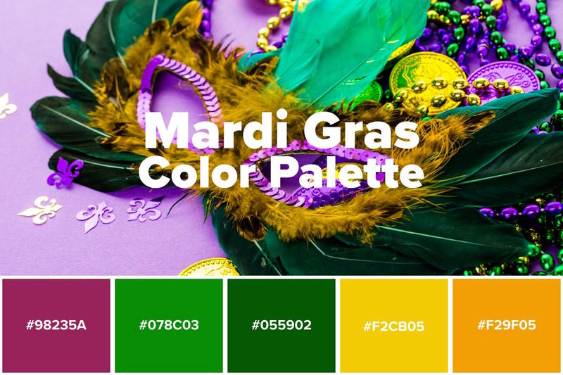
You can use shades of purple – associated with mystery. You can use shades of green as they are associated with energy and nature. Similarly, you can add warm shades of yellow and gold to portray warmth and extravagance that come to mind when you think of carnivals.
Graphic design color palettes for carnivals are usually bright and mysterious. You can combine the carnival colors mentioned above to create stunning designs.
St Patricks Day
St. Patricks Day is something we all love celebrating. This bright, fun day falls during the spring season and allows you to spend time with friends, party, and dance with the people you love.
This celebration came with its traditions and colors and originated in Ireland, which is why you see shamrocks, leprechauns, and other elements from the Irish culture during the celebrations.
When you think of St. Patricks Day, the first color that comes to mind is bright green – the color of plants in the lush Irish countryside. Green is associated with hope and optimism. You can use different shades of green in the St. Patricks Day color palette. Play with these fun colors to create an attractive design for the occasion.
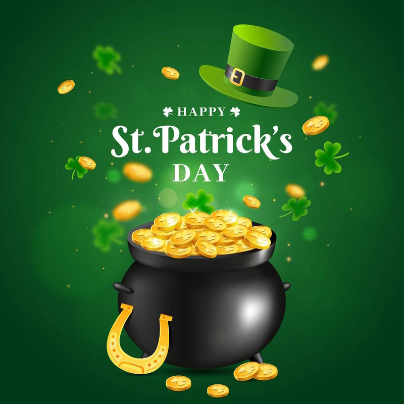
Moreover, you can also use shades of yellow and gold to mark the new beginnings, festive spirit, and warmth of family and love. St. Patricks Day colors and images are bright and exciting, and full of warmth.
Easter
Another festival that falls in the Spring season is the Easter. This Christian holiday is celebrated by millions of people around the world. The day marks the beginning of Spring and has fun traditions that vary from place to place. Easter eggs, Easter bunny, flowers, drinks, and desserts are most commonly a part of Easter celebrations.
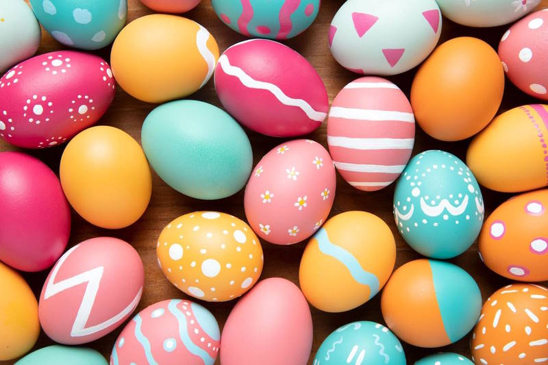
When it comes to Easter color palette, you can use a combination of festive Easter colors and design ideas. Most commonly, shades of fresh blooming flowers feature in the Easter graphic designs to mark the spring season. You can also use shades of pink, mauve, and rose that represent Easter colors and design flowers, Easter eggs, and the celebrations.
Shades of yellow represent the glow and warmth of sunny mornings, and tints of blue can add calm and soothness to your designs. Easter is a colorful and cheerful celebration and the color palettes should also represent that.
Emerging Color Trends for 2023
Now that you know what graphic design color palettes are, and how you can use them to represent different celebrations and festivities, let’s take a look at some of the emerging trends in color palettes.
The trends in color palettes vary with time, and a good designer keeps himself updated with the latest trends. We have made a list of trending color palettes.
Color Palette #1 Icy Blue
Vibrant, bright colors can add a fun element to your designs. They can make your designs stand out. Using blue, green, and lilac tones can give your graphic designs a cool, soothing vibe that can attract the viewers.
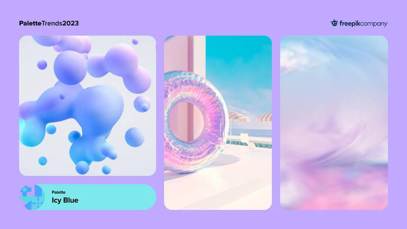
Such color palettes have become quite common these days, and you can also use this trending palette in your designs.
Color Palette #2 Lit Sunset
Warm shades of sunset never go out of trend. You can use these warm colors for a variety of themes. From wedding invites to event posters, warm sunset tones of orange, red, and yellow can create a cozy feel for your design.
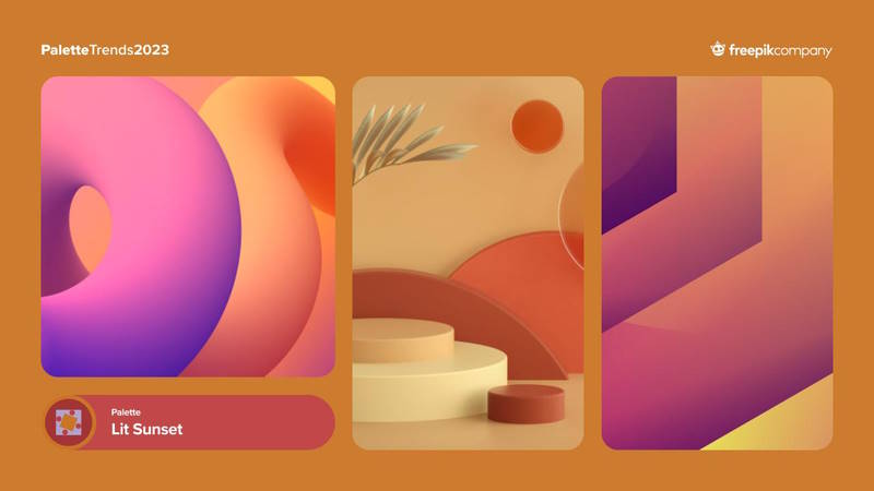
You can combine these colors with lilac and purple to make your design visually attractive.
Color Palette #3 Natural Green
Color palettes inspired by nature can always make your designs appear visually pleasing. Tones of green, brown, and yellow remind us of nature and the need to protect it.
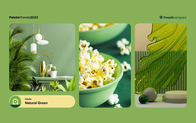
You can use this color palette in the product packaging, invitations, and ads. For designs that deal with natural products, tourism, and sustainability can use the natural green color palette.
Conclusion
Graphic design color palettes are an integral part of the design process. Choosing the right palette for your design theme can make or break it. You can use different color palettes for designs related to different celebrations and events. Beautiful, trending designs can be created by using the trending color palettes for 2023. With a good understanding of color palettes, you can create designs that are stunning and attract people.
Awesome collection